Plotting negative values
This example shows how to plot data with negative as well as positive values.
Import packages / modules
Import dmslogo along with the other Python packages used in these examples:
[1]:
# NBVAL_IGNORE_OUTPUT

import matplotlib.pyplot as plt

import numpy

import pandas as pd

import dmslogo
from dmslogo.colorschemes import CBPALETTE
Set options to display pandas DataFrames:
[2]:
pd.set_option("display.max_columns", 20)
pd.set_option("display.width", 500)
Simple logo plot on toy data
Recall that dmslogo.logo.draw_logo takes as input a pandas DataFrame that has columns with:
site in sequential integer numbering
letter (i.e., amino acid or nucleotide)
height of letter (can be any positive number)
Here make a simple data frame that fits these specs, including some negative values:
[3]:
data = pd.DataFrame.from_records(
    data=[
        (1, "A", 1),
        (1, "C", 0.1),
        (1, "D", -0.3),
        (2, "C", -0.1),
        (2, "D", 1.2),
        (2, "M", 0.2),
        (5, "A", -0.4),
        (5, "K", 0.4),
    ],
    columns=["site", "letter", "height"],
)

data
[3]:
| site | letter | height | |
|---|---|---|---|
| 0 | 1 | A | 1.0 |
| 1 | 1 | C | 0.1 |
| 2 | 1 | D | -0.3 |
| 3 | 2 | C | -0.1 |
| 4 | 2 | D | 1.2 |
| 5 | 2 | M | 0.2 |
| 6 | 5 | A | -0.4 |
| 7 | 5 | K | 0.4 |
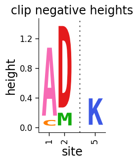
Now use dmslogo.logo.draw_logo to draw the logo plot with the clip_negative_heights flag set to True. As you can see below, the result is a plot that only shows the positive values:
[4]:
# NBVAL_IGNORE_OUTPUT

fig, ax = dmslogo.draw_logo(
    data=data,
    x_col="site",
    letter_col="letter",
    letter_height_col="height",
    clip_negative_heights=True,
    title="clip negative heights",
)
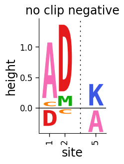
Now let’s draw the same plot but not clip the negative heights, see how the resulting plot shows the positive heights above and the negative heights below a black center line at zero:
[5]:
# NBVAL_IGNORE_OUTPUT

fig, ax = dmslogo.draw_logo(
    data=data,
    x_col="site",
    letter_col="letter",
    letter_height_col="height",
    title="no clip negative",
)
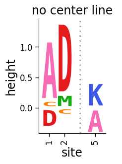
If you do not want to include the center line, set draw_line_at_zero to 'never':
[6]:
# NBVAL_IGNORE_OUTPUT

fig, ax = dmslogo.draw_logo(
    data=data,
    x_col="site",
    letter_col="letter",
    letter_height_col="height",
    title="no center line",
    draw_line_at_zero="never",
)
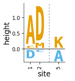
We can also make a plot where we color the letters above and below the line different colors:
[7]:
# NBVAL_IGNORE_OUTPUT

fig, ax = dmslogo.draw_logo(
    data=data.assign(
        color=lambda x: numpy.where(x["height"] > 0, CBPALETTE[1], CBPALETTE[2])
    ),
    x_col="site",
    letter_col="letter",
    letter_height_col="height",
    color_col="color",
)
Logo plots of HA immune selection
Now we make logo plots of real data from serum selection on influenza hemagglutinin (HA). These plots show differential selection values, which can be positive or negative depending on whether a mutation is enriched or depleted after immune selection.
First, read in the data:
[8]:
ha_df = pd.read_csv("input_files/HA_serum_diffsel.csv")

ha_df.head()
[8]:
| sample | isite | site | wildtype | mutation | mutdiffsel | positive_diffsel | negative_diffsel | |
|---|---|---|---|---|---|---|---|---|
| 0 | age 2.2 | 0 | -16 | M | A | -1.525 | 0.0 | -16.841 |
| 1 | age 2.2 | 0 | -16 | M | C | -1.040 | 0.0 | -16.841 |
| 2 | age 2.2 | 0 | -16 | M | D | -1.675 | 0.0 | -16.841 |
| 3 | age 2.2 | 0 | -16 | M | E | -1.050 | 0.0 | -16.841 |
| 4 | age 2.2 | 0 | -16 | M | F | -0.833 | 0.0 | -16.841 |
Add a site label that gives both the site number and wildtype identity, and also indicate which sites to show in the logo plots:
[9]:
sites_to_show = [
    "157",
    "158",
    "159",
    "160",
    "188",
    "189",
    "190",
    "192",
    "193",
    "194",
    "221",
    "222",
    "223",
]

ha_df = ha_df.assign(
    site_label=lambda x: x["wildtype"] + x["site"],
    to_show=lambda x: x["site"].isin(sites_to_show),
)
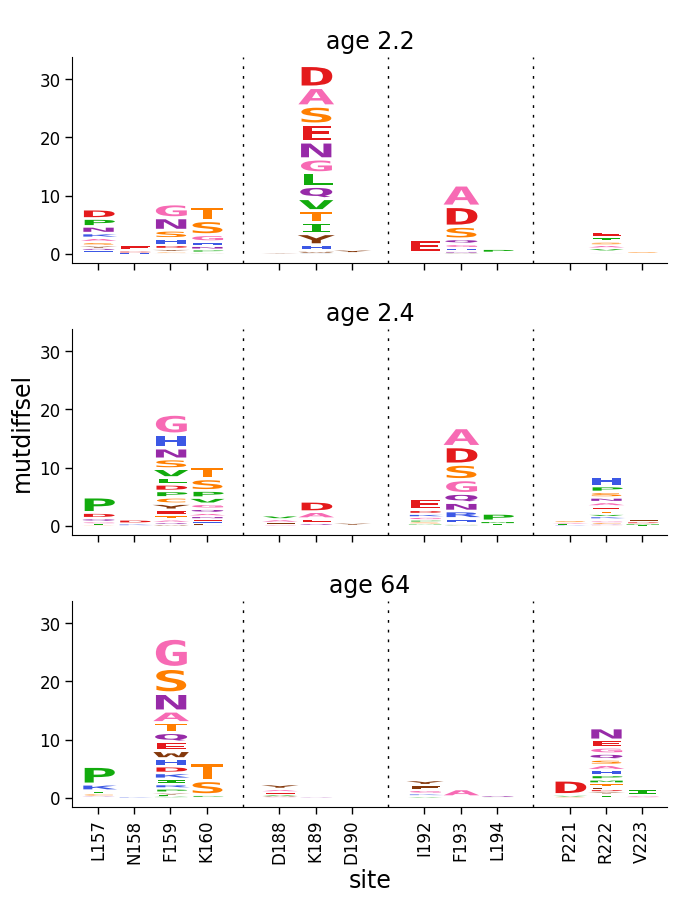
First let’s use dmslogo.facet.facet_plot to facet logo plots for the samples. First, we do this using clip_negative_heights to only show the posittive values:
[10]:
# NBVAL_IGNORE_OUTPUT

fig, axes = dmslogo.facet_plot(
    ha_df,
    gridrow_col="sample",
    x_col="isite",
    show_col="to_show",
    draw_logo_kwargs={
        "letter_col": "mutation",
        "letter_height_col": "mutdiffsel",
        "xtick_col": "site_label",
        "xlabel": "site",
        "clip_negative_heights": True,
    },
)
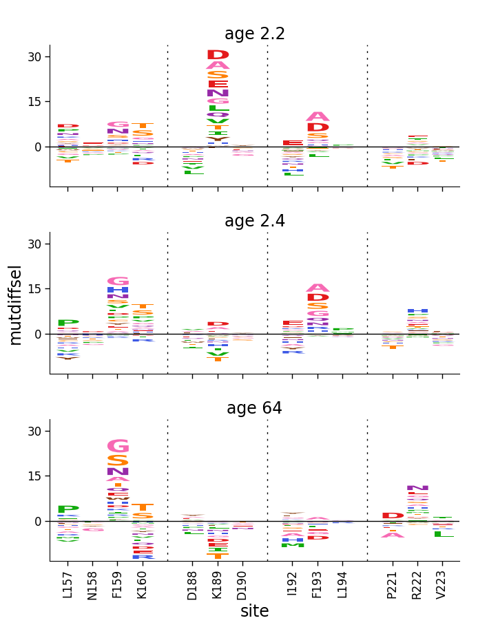
Now don’t clip the negative values, but show those too:
[11]:
# NBVAL_IGNORE_OUTPUT

fig, axes = dmslogo.facet_plot(
    ha_df,
    gridrow_col="sample",
    x_col="isite",
    show_col="to_show",
    draw_logo_kwargs={
        "letter_col": "mutation",
        "letter_height_col": "mutdiffsel",
        "xtick_col": "site_label",
        "xlabel": "site",
    },
)
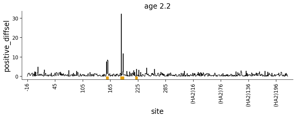
Line plots of site-wise values
We can use dmslogo.line.draw_line to indicate a site-level selection. This is fairly straightforward if we are showing always positive values:
[12]:
# NBVAL_IGNORE_OUTPUT

fig, ax = dmslogo.draw_line(
    ha_df.query('sample == "age 2.2"'),
    x_col="isite",
    height_col="positive_diffsel",
    xtick_col="site",
    show_col="to_show",
    title="age 2.2",
    widthscale=2,
)
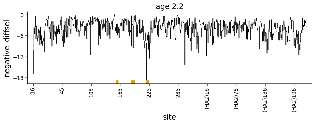
Or always negative values:
[13]:
# NBVAL_IGNORE_OUTPUT

fig, ax = dmslogo.draw_line(
    ha_df.query('sample == "age 2.2"'),
    x_col="isite",
    height_col="negative_diffsel",
    xtick_col="site",
    show_col="to_show",
    title="age 2.2",
    widthscale=2,
)
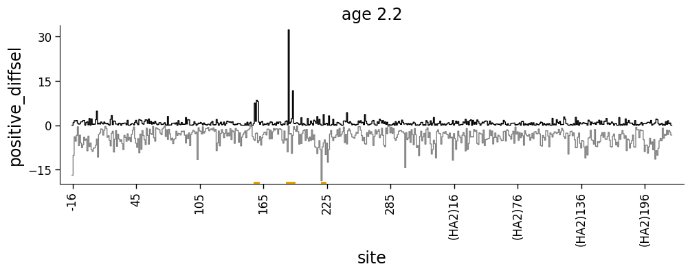
But what if we want to show both positive and negative values? We can do this using the height_col2 argument to dmslogo.line.draw_line
[14]:
# NBVAL_IGNORE_OUTPUT

fig, ax = dmslogo.draw_line(
    ha_df.query('sample == "age 2.2"'),
    x_col="isite",
    height_col="positive_diffsel",
    height_col2="negative_diffsel",
    xtick_col="site",
    show_col="to_show",
    title="age 2.2",
    widthscale=2,
)
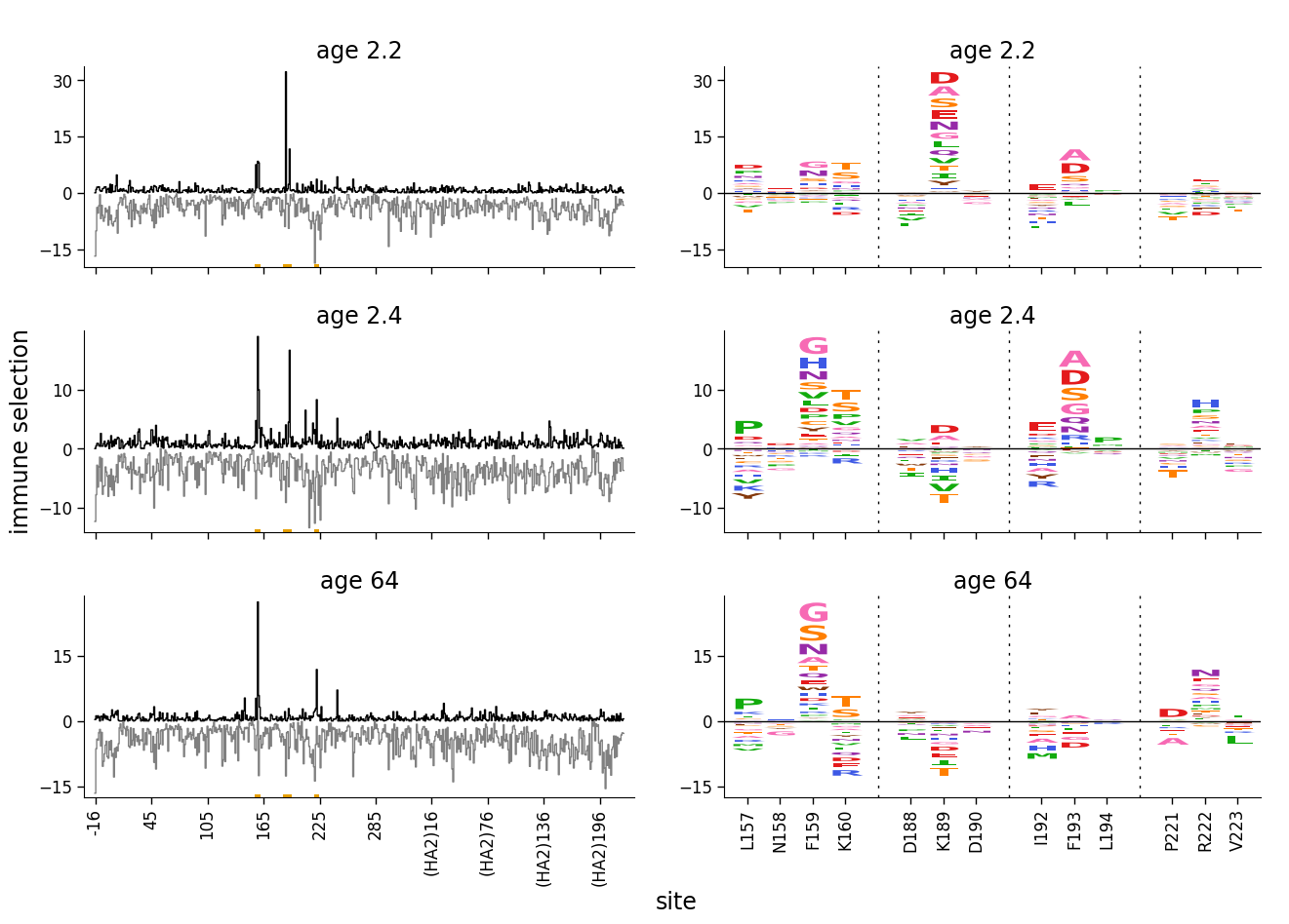
Faceting line and logo plots
Now we facet line and logo plots with negative values using dmslogo.facet.facet_plot:
[15]:
# NBVAL_IGNORE_OUTPUT

fig, axes = dmslogo.facet_plot(
    ha_df,
    gridrow_col="sample",
    x_col="isite",
    show_col="to_show",
    draw_line_kwargs={
        "height_col": "positive_diffsel",
        "xtick_col": "site",
        "height_col2": "negative_diffsel",
        "ylabel": "immune selection",
    },
    draw_logo_kwargs={
        "letter_col": "mutation",
        "letter_height_col": "mutdiffsel",
        "xtick_col": "site_label",
        "xlabel": "site",
        "ylabel": "immune selection",
    },
    share_ylabel=True,
    share_xlabel=True,
    share_ylim_across_rows=False,
)
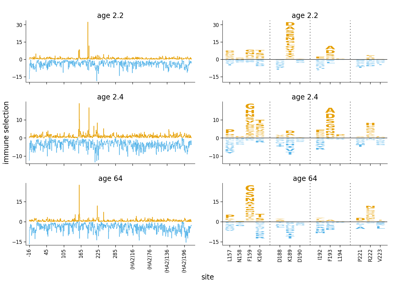
We can make the plot look even clearer if we color the positive and negative selection differently.
First, color letters by whether mutation-level differential selection is positive or negative:
[16]:
ha_df = ha_df.assign(
    color=lambda x: numpy.where(x["mutdiffsel"] > 0, CBPALETTE[1], CBPALETTE[2])
)
Now re-make the facetted plot using these colors for the logo plot, and setting the colors for the line plot (color, color2) to match across plots (positive selection is orange, negative selection is blue). Finally, we set show_color for draw_line_kwargs to None so that there isn’t any underlining in line plots:
[17]:
# NBVAL_IGNORE_OUTPUT

fig, axes = dmslogo.facet_plot(
    ha_df,
    gridrow_col="sample",
    x_col="isite",
    show_col="to_show",
    draw_line_kwargs={
        "height_col": "positive_diffsel",
        "xtick_col": "site",
        "height_col2": "negative_diffsel",
        "ylabel": "immune selection",
        "color": CBPALETTE[1],
        "color2": CBPALETTE[2],
        "show_color": None,
    },
    draw_logo_kwargs={
        "letter_col": "mutation",
        "letter_height_col": "mutdiffsel",
        "xtick_col": "site_label",
        "xlabel": "site",
        "ylabel": "immune selection",
        "color_col": "color",
    },
    share_ylabel=True,
    share_xlabel=True,
    share_ylim_across_rows=False,
)
[ ]: