Plotting heatmap overlays
Import dmslogo along with the other Python packages used in this example:
[1]:
# NBVAL_IGNORE_OUTPUT

import matplotlib.pyplot as plt

import numpy

import palettable

import pandas as pd

import dmslogo
import dmslogo.colorschemes
We will make an overlay with two properties shown at a site level. Make a simple data frame that gives these site values (note how the overlay values are the same for each letter at each site, since the are site level overlays):
[2]:
data = pd.DataFrame.from_records(
    data=[
        (1, "A", 1, 1, 0),
        (1, "C", 0.7, 1, 0),
        (2, "C", 0.1, 3, 2),
        (2, "D", 1.2, 3, 2),
        (5, "A", 0.4, 2, 4),
        (5, "K", 0.4, 2, 4),
    ],
    columns=["site", "letter", "height", "overlay_val_1", "overlay_val_2"],
)

data
[2]:
| site | letter | height | overlay_val_1 | overlay_val_2 | |
|---|---|---|---|---|---|
| 0 | 1 | A | 1.0 | 1 | 0 |
| 1 | 1 | C | 0.7 | 1 | 0 |
| 2 | 2 | C | 0.1 | 3 | 2 |
| 3 | 2 | D | 1.2 | 3 | 2 |
| 4 | 5 | A | 0.4 | 2 | 4 |
| 5 | 5 | K | 0.4 | 2 | 4 |
First, we need to convert the numerical values in the data frame to colors. To do that, we create a dmslogo.colorschemes.ValueToColorMap for each overlay value. Note that you define your own matplotlib.colors.Colormap, or use the name of any pre-built matplotlib colormap or any in the larger set provided by
palettable.
Note how below we define each color map, use it create a column in data giving the color, and then also draw the scale bar. This last step is necessary if you want to be able to get a matplotlib.Figure that you can use to save the scale bar to show along with the logo plot:
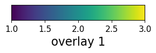
[3]:
# NBVAL_IGNORE_OUTPUT
print(f"\nHere is scale bar for first overlay:")
map1 = dmslogo.colorschemes.ValueToColorMap(
minvalue=data["overlay_val_1"].min(),
maxvalue=data["overlay_val_1"].max(),
cmap="viridis",
)
map1_fig, _ = map1.scale_bar(orientation="horizontal", label="overlay 1")
display(map1_fig)
plt.close(map1_fig)
data["overlay 1"] = map1.val_to_color(data["overlay_val_1"])
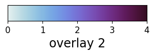
print(f"\nHere is scale bar for second overlay:")
map2 = dmslogo.colorschemes.ValueToColorMap(
minvalue=data["overlay_val_2"].min(),
maxvalue=data["overlay_val_2"].max(),
cmap=palettable.cmocean.sequential.Dense_20.mpl_colormap,
)
map2_fig, _ = map2.scale_bar(orientation="horizontal", label="overlay 2")
display(map2_fig)
plt.close(map2_fig)
data["overlay 2"] = map2.val_to_color(data["overlay_val_2"])
data
Here is scale bar for first overlay:
Here is scale bar for second overlay:
[3]:
| site | letter | height | overlay_val_1 | overlay_val_2 | overlay 1 | overlay 2 | |
|---|---|---|---|---|---|---|---|
| 0 | 1 | A | 1.0 | 1 | 0 | #440154 | #e6f1f1 |
| 1 | 1 | C | 0.7 | 1 | 0 | #440154 | #e6f1f1 |
| 2 | 2 | C | 0.1 | 3 | 2 | #fde724 | #7770d4 |
| 3 | 2 | D | 1.2 | 3 | 2 | #fde724 | #7770d4 |
| 4 | 5 | A | 0.4 | 2 | 4 | #20908c | #360e24 |
| 5 | 5 | K | 0.4 | 2 | 4 | #20908c | #360e24 |
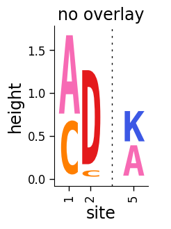
Now first use dmslogo.logo.draw_logo to draw the logo plot without any overlays:
[4]:
# NBVAL_IGNORE_OUTPUT

fig, axes = dmslogo.draw_logo(
    data=data,
    x_col="site",
    letter_col="letter",
    letter_height_col="height",
    title="no overlay",
)
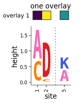
Now use dmslogo.logo.draw_logo to draw the logo plot with the first overlay:
[5]:
# NBVAL_IGNORE_OUTPUT

fig, ax = dmslogo.draw_logo(
    data=data,
    x_col="site",
    letter_col="letter",
    letter_height_col="height",
    title="one overlay",
    heatmap_overlays=["overlay 1"],
)
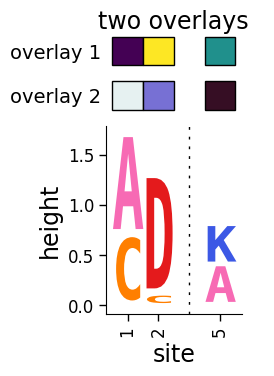
Draw with both overlays:
[6]:
# NBVAL_IGNORE_OUTPUT

fig, axes = dmslogo.draw_logo(
    data=data,
    x_col="site",
    letter_col="letter",
    letter_height_col="height",
    title="two overlays",
    heatmap_overlays=["overlay 1", "overlay 2"],
)