Basic example
Import packages / modules
Import dmslogo along with the other Python packages used in these examples:
[1]:
# NBVAL_IGNORE_OUTPUT

import os
import random

from IPython.display import display, Image

import matplotlib.pyplot as plt

import numpy

import pandas as pd

import dmslogo
from dmslogo.colorschemes import CBPALETTE
Set options to display pandas DataFrames:
[2]:
pd.set_option("display.max_columns", 20)
pd.set_option("display.width", 500)
Simple example on toy data
Draw a basic logo
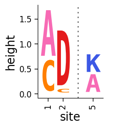
Simple plotting can be done using the dmslogo.logo.draw_logo function.
This function takes in as input a pandas DataFrame that has columns with:
site in sequential integer numbering
letter (i.e., amino acid or nucleotide)
height of letter (can be any positive number)
Here make a simple data frame that fits these specs:
[3]:
data = pd.DataFrame.from_records(
    data=[
        (1, "A", 1),
        (1, "C", 0.7),
        (2, "C", 0.1),
        (2, "D", 1.2),
        (5, "A", 0.4),
        (5, "K", 0.4),
    ],
    columns=["site", "letter", "height"],
)

data
[3]:
| site | letter | height | |
|---|---|---|---|
| 0 | 1 | A | 1.0 |
| 1 | 1 | C | 0.7 |
| 2 | 2 | C | 0.1 |
| 3 | 2 | D | 1.2 |
| 4 | 5 | A | 0.4 |
| 5 | 5 | K | 0.4 |
Use dmslogo.logo.draw_logo to draw the logo plot, passing the names of the columns with each piece of required data:
[4]:
# NBVAL_IGNORE_OUTPUT

fig, ax = dmslogo.draw_logo(
    data=data, x_col="site", letter_col="letter", letter_height_col="height"
)
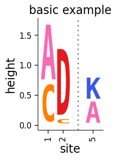
Add a title:
[5]:
# NBVAL_IGNORE_OUTPUT

fig, ax = dmslogo.draw_logo(
    data=data,
    x_col="site",
    letter_col="letter",
    letter_height_col="height",
    title="basic example",
)
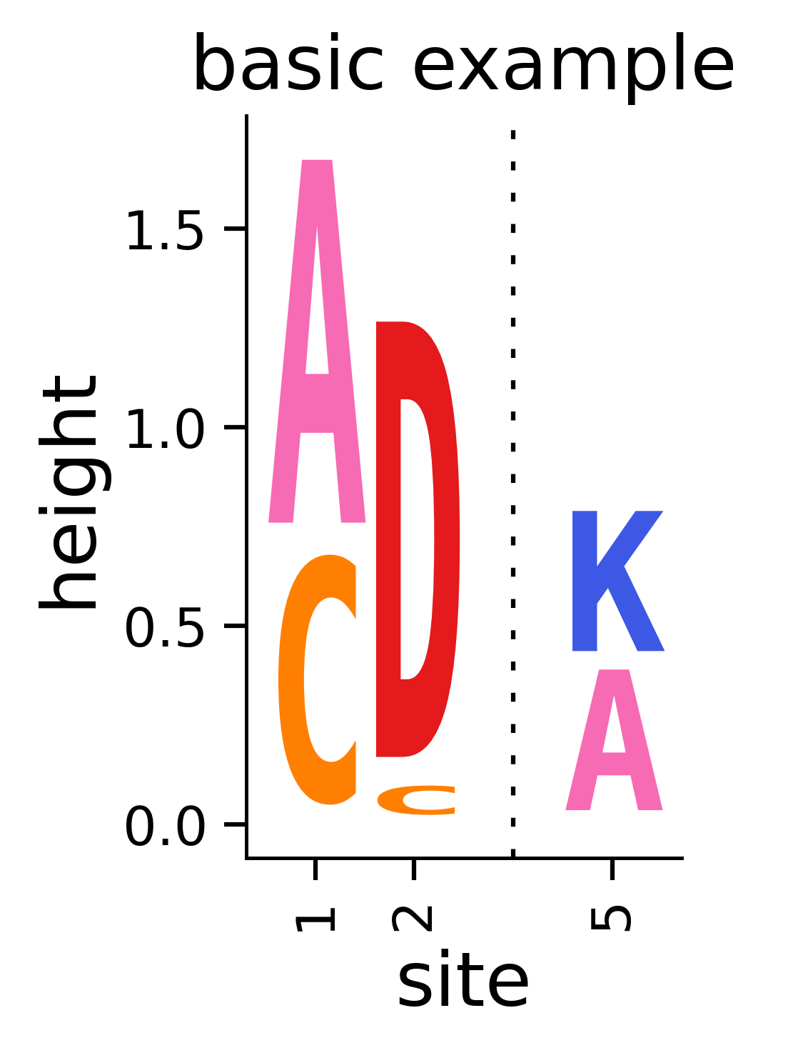
Note that the call to dmslogo.logo.draw_logo returns matplotlib Figure and Axis instances, which we have called fig and ax. We can save the figure to a file using the savefig command of fig. Below we show an example of how to do this saving to a temporary file:
[6]:
outputdir = "output_files"
os.makedirs(outputdir, exist_ok=True)
pngfile = os.path.join(outputdir, "basic_example_logo.png")

print(f"Saving figure to {pngfile}")
fig.savefig(pngfile, dpi=450, bbox_inches="tight")

print(f"Here is a rendering of the saved figure:")
display(Image(pngfile, width=200))
Saving figure to output_files/basic_example_logo.png
Here is a rendering of the saved figure:
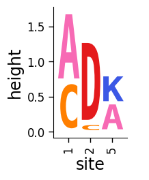
Drawing without breaks
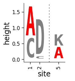
Note how the above plot has a “break” (gap and dashed line) to indicate a break in the sequential numbering in x_col between 2 and 5. This is useful as it indicates when we are breaking the sequence when drawing just snippets of a protein. If you do not want to indicate breaks in this way, turn off the addbreaks option. Now the logo just goes directly from 2 to 5 without indicating a break:
[7]:
# NBVAL_IGNORE_OUTPUT

fig, ax = dmslogo.draw_logo(
    data=data,
    x_col="site",
    letter_col="letter",
    letter_height_col="height",
    addbreaks=False,
)
Setting letter colors
The above plot colored letters using a default amino-acid coloring scheme. You can set a different coloring scheme using colorscheme and missing_color, or you can set letter colors at a site-specific level by adding a column to data that specifies the colors. Here we color letters at site-specific level:
[8]:
data["color"] = ["red", "gray", "gray", "gray", "red", "gray"]
data
[8]:
| site | letter | height | color | |
|---|---|---|---|---|
| 0 | 1 | A | 1.0 | red |
| 1 | 1 | C | 0.7 | gray |
| 2 | 2 | C | 0.1 | gray |
| 3 | 2 | D | 1.2 | gray |
| 4 | 5 | A | 0.4 | red |
| 5 | 5 | K | 0.4 | gray |
Now plot using color_col to set the colors:
[9]:
# NBVAL_IGNORE_OUTPUT

fig, ax = dmslogo.draw_logo(
    data=data,
    x_col="site",
    letter_col="letter",
    letter_height_col="height",
    color_col="color",
)
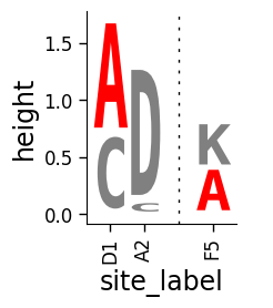
Labeling x-axis ticks
Sometimes we want to label sites with something other than the sequential integer numbers. We can do this by adding a column for the xtick labels to data:
[10]:
data["site_label"] = ["D1", "D1", "A2", "A2", "F5", "F5"]
data
[10]:
| site | letter | height | color | site_label | |
|---|---|---|---|---|---|
| 0 | 1 | A | 1.0 | red | D1 |
| 1 | 1 | C | 0.7 | gray | D1 |
| 2 | 2 | C | 0.1 | gray | A2 |
| 3 | 2 | D | 1.2 | gray | A2 |
| 4 | 5 | A | 0.4 | red | F5 |
| 5 | 5 | K | 0.4 | gray | F5 |
Now use xtick_col to set the xticks:
[11]:
# NBVAL_IGNORE_OUTPUT

fig, ax = dmslogo.draw_logo(
    data=data,
    x_col="site",
    letter_col="letter",
    letter_height_col="height",
    color_col="color",
    xtick_col="site_label",
)
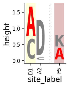
Shading some sites
Sometimes we may want to shade certain sites. To do this, we specify the shade color and transparency (alpha) for all sites we want to shade (must be the same for all letters at a site):
[12]:
data["shade_color"] = ["yellow", "yellow", None, None, "brown", "brown"]
data["shade_alpha"] = [0.15, 0.15, None, None, 0.3, 0.3]
data
[12]:
| site | letter | height | color | site_label | shade_color | shade_alpha | |
|---|---|---|---|---|---|---|---|
| 0 | 1 | A | 1.0 | red | D1 | yellow | 0.15 |
| 1 | 1 | C | 0.7 | gray | D1 | yellow | 0.15 |
| 2 | 2 | C | 0.1 | gray | A2 | None | NaN |
| 3 | 2 | D | 1.2 | gray | A2 | None | NaN |
| 4 | 5 | A | 0.4 | red | F5 | brown | 0.30 |
| 5 | 5 | K | 0.4 | gray | F5 | brown | 0.30 |
Now use shade_color_col and shade_alpha_col to draw the logo with the shaded sites:
[13]:
# NBVAL_IGNORE_OUTPUT

fig, ax = dmslogo.draw_logo(
    data=data,
    x_col="site",
    letter_col="letter",
    letter_height_col="height",
    color_col="color",
    xtick_col="site_label",
    shade_color_col="shade_color",
    shade_alpha_col="shade_alpha",
)
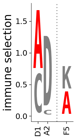
Adjusting size, axis labels, axes
We can do additional formatting by scaling the width (widthscale), the height (heightscale), the axis font (axisfontscale), the x-axis (xlabel) and y-axis (ylabel) labels, and removing the axes altogether (hide_axis).
First, we make a plot where we adjust the size, change the y-axis label, and get rid of the x-axis label:
[14]:
# NBVAL_IGNORE_OUTPUT

fig, ax = dmslogo.draw_logo(
    data=data,
    x_col="site",
    letter_col="letter",
    letter_height_col="height",
    color_col="color",
    xtick_col="site_label",
    xlabel="",
    ylabel="immune selection",
    heightscale=2,
    axisfontscale=1.5,
)
Now we make a plot where we hide the axes and their labels altogether:
[15]:
# NBVAL_IGNORE_OUTPUT

fig, ax = dmslogo.draw_logo(
    data=data,
    x_col="site",
    letter_col="letter",
    letter_height_col="height",
    color_col="color",
    xtick_col="site_label",
    hide_axis=True,
)

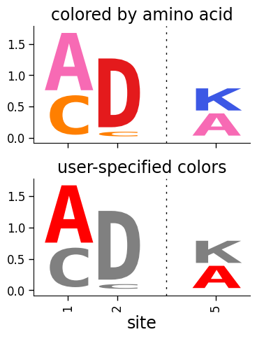
Multiple logos in one figure
So far we have made individual plots on newly generate figures created by dmslogo.logo.draw_logo.
But we can also create a multi-axis figure, and then draw several logos onto that. The easiest way to do this is with the dmslogo.facet.facet_plot command described below. But we can also do it using matplotlib subplots as here:
[16]:
# NBVAL_IGNORE_OUTPUT

# make figure with two subplots: two rows, one column
fig, axes = plt.subplots(2, 1)
fig.subplots_adjust(hspace=0.3)  # add more vertical space for axis titles
fig.set_size_inches(4, 5)

# draw top plot, no x-axis ticks or label, default coloring
_ = dmslogo.draw_logo(
    data.assign(no_ticks=""),
    x_col="site",
    letter_col="letter",
    letter_height_col="height",
    ax=axes[0],
    xlabel="",
    ylabel="",
    xtick_col="no_ticks",
    title="colored by amino acid",
)

# draw bottom plot, color as specified in `data`
_ = dmslogo.draw_logo(
    data,
    x_col="site",
    letter_col="letter",
    letter_height_col="height",
    color_col="color",
    ax=axes[1],
    ylabel="",
    title="user-specified colors",
)
Real HIV data from Dingens et al
In An Antigenic Atlas of HIV-1 Escape from Broadly Neutralizing Antibodies Distinguishes Functional and Structural Epitopes (Dingens et al, 2019), there are plots of immune selection on HIV envelope (Env) from anti-HIV antibodies at just a subset of “strongly selected” sites for each antibody.
Here we use dmslogo to re-create one of those plots (the one in Figure 3D,E) showing antibodies PG9 and PGT145.
Get data to plot
We have already downloaded CSV files with the data from the paper’s GitHub repo giving the immune selection (as fraction surviving above average) for these two antibodies We read the data into a pandas data frame:
[17]:
antibodies = ["PG9", "PGT145"]

data_hiv = []
for antibody in antibodies:
    fname = f"input_files/summary_{antibody}-medianmutfracsurvive.csv"
    print(f"Reading data for {antibody} from {fname}")
    data_hiv.append(pd.read_csv(fname).assign(antibody=antibody))

data_hiv = pd.concat(data_hiv)
Reading data for PG9 from input_files/summary_PG9-medianmutfracsurvive.csv
Reading data for PGT145 from input_files/summary_PGT145-medianmutfracsurvive.csv
Here are the first few lines of the data frame. For each mutation it gives the immune selection (mutfracsurvive):
[18]:
data_hiv.head(n=5)
[18]:
| site | wildtype | mutation | mutfracsurvive | antibody | |
|---|---|---|---|---|---|
| 0 | 160 | N | I | 0.256342 | PG9 |
| 1 | 160 | N | L | 0.207440 | PG9 |
| 2 | 160 | N | R | 0.184067 | PG9 |
| 3 | 171 | K | E | 0.176118 | PG9 |
| 4 | 428 | Q | Y | 0.150981 | PG9 |
The sites in this data frame are in the HXB2 numbering scheme, which is not the same as sequential integer numbering of the actual BG505 Env for which the immune selection was measured. So for our plotting, we also need to create a column (which we will call isite) that numbers the sites a sequential numbering. A file that converts between HXB2 and and BG505 numbering is part of the paper’s GitHub
repo; here we use a downloaded copy of that file to make the isite column:
[19]:
numberfile = "input_files/BG505_to_HXB2.csv"

data_hiv = (
    pd.read_csv(numberfile)
    .rename(columns={"original": "isite", "new": "site"})[["site", "isite"]]
    .merge(data_hiv, on="site", validate="one_to_many")
)
Now see how this data frame also has the isite column which has sequential integer numbering of the sequence:
[20]:
data_hiv.head(n=5)
[20]:
| site | isite | wildtype | mutation | mutfracsurvive | antibody | |
|---|---|---|---|---|---|---|
| 0 | 31 | 30 | A | Y | 0.030824 | PG9 |
| 1 | 31 | 30 | A | K | 0.006860 | PG9 |
| 2 | 31 | 30 | A | D | 0.006774 | PG9 |
| 3 | 31 | 30 | A | S | 0.004407 | PG9 |
| 4 | 31 | 30 | A | R | 0.003501 | PG9 |
We add a column (site_label) that gives the site labeled with the wildtype identity that we can use for axis ticks. We also indicate which sites to show (column show_site) in our logoplot snippet (these are just the same ones in Figure 3 of the Dingens et al (2019) paper):
[21]:
# same sites in Figure 3D,E of Dingens et al (2019)
sites_to_show = map(
    str,
    list(range(119, 125))
    + [127]
    + list(range(156, 174))
    + list(range(199, 205))
    + list(range(312, 316)),
)

data_hiv = data_hiv.assign(
    site_label=lambda x: x["wildtype"] + x["site"],
    show_site=lambda x: x["site"].isin(sites_to_show),
)
See how the data frame now has the site_label and show_site columns:
[22]:
data_hiv.head(n=5)
[22]:
| site | isite | wildtype | mutation | mutfracsurvive | antibody | site_label | show_site | |
|---|---|---|---|---|---|---|---|---|
| 0 | 31 | 30 | A | Y | 0.030824 | PG9 | A31 | False |
| 1 | 31 | 30 | A | K | 0.006860 | PG9 | A31 | False |
| 2 | 31 | 30 | A | D | 0.006774 | PG9 | A31 | False |
| 3 | 31 | 30 | A | S | 0.004407 | PG9 | A31 | False |
| 4 | 31 | 30 | A | R | 0.003501 | PG9 | A31 | False |
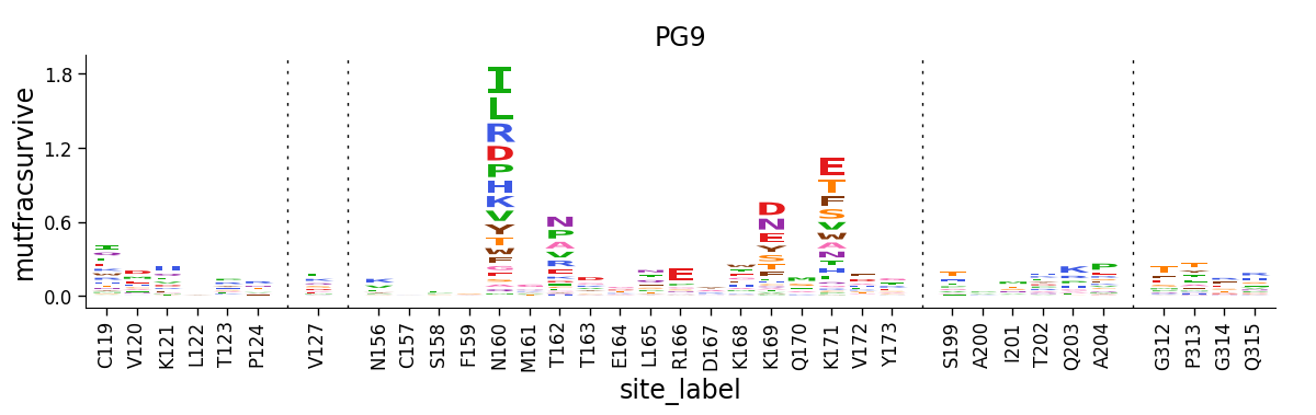
Draw a logo plot
Now we make logo plots of the sites that we have selected to show, here just for the PG9 antibody. Note how we query data_hiv for only the antibody (PG9) and the sites of interest (show_site is True):
[23]:
# NBVAL_IGNORE_OUTPUT

fig, ax = dmslogo.draw_logo(
    data_hiv.query('antibody == "PG9"').query("show_site"),
    x_col="isite",
    letter_col="mutation",
    letter_height_col="mutfracsurvive",
    xtick_col="site_label",
    title="PG9",
)
Draw site-level line plots
The logo plot above shows selection at a subset of sites. But we might also want to summarize the selection across all sites (as is done in Figure 2 of Dingens et al (2019)).
An easy way to do this is to create a summary statistic at each site. Here we compute the total fracsurvive at each site across all mutations, and add that to our data frame:
[24]:
data_hiv = data_hiv.query(
    "mutation != wildtype"
).assign(  # only care about mutations; get rid of wildtype values
    totfracsurvive=lambda x: x.groupby(["antibody", "site"])[
        "mutfracsurvive"
    ].transform("sum")
)
Now the data frame has a column (totfracsurvive) giving the average fraction surviving at each site:
[25]:
data_hiv.head(n=5)
[25]:
| site | isite | wildtype | mutation | mutfracsurvive | antibody | site_label | show_site | totfracsurvive | |
|---|---|---|---|---|---|---|---|---|---|
| 0 | 31 | 30 | A | Y | 0.030824 | PG9 | A31 | False | 0.062502 |
| 1 | 31 | 30 | A | K | 0.006860 | PG9 | A31 | False | 0.062502 |
| 2 | 31 | 30 | A | D | 0.006774 | PG9 | A31 | False | 0.062502 |
| 3 | 31 | 30 | A | S | 0.004407 | PG9 | A31 | False | 0.062502 |
| 4 | 31 | 30 | A | R | 0.003501 | PG9 | A31 | False | 0.062502 |
Now we use the dmslogo.line.draw_line function to draw the line plot for antibody PG9. Note how we provide our new totfracsurvive column as height_col. We also provide our previously defined show_site column (which indicates which sites were shown in the logo plot) as the show_col, so that the line plot has the sites shown in the above logo plot underlined in orange:
[26]:
# NBVAL_IGNORE_OUTPUT

fig, ax = dmslogo.draw_line(
    data_hiv.query('antibody == "PG9"'),
    x_col="isite",
    height_col="totfracsurvive",
    xtick_col="site",
    show_col="show_site",
    title="PG9",
    widthscale=2,
)
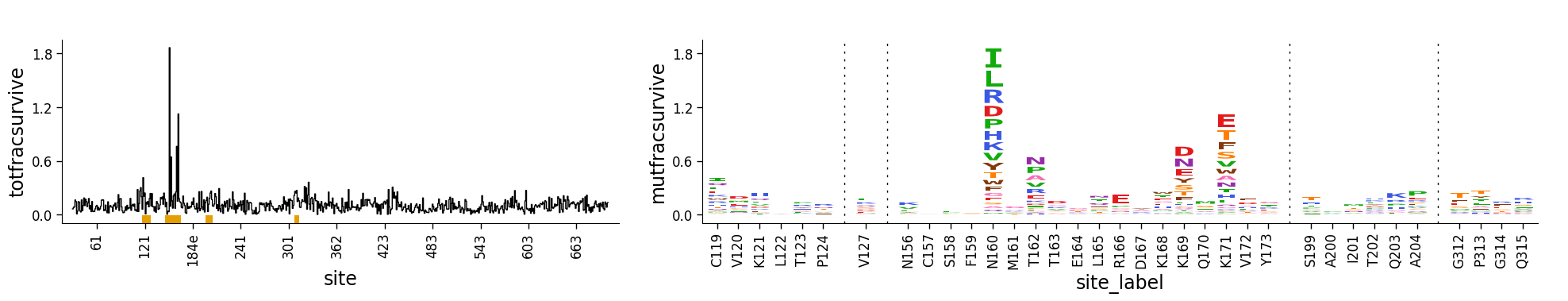
Combining site-level line and mutation-level logo plots
Of course, a line plot isn’t that hard to make, but the advantage of doing this using the approach above is that we can combine dmslogo.line.draw_line and dmslogo.logo.draw_logo to create a single figure that shows the site-selection in a line plot and the selected sites as logo plots.
The easiest way to do this using the dmslogo.facet.facet_plot command described below. But first here we do it using matplotlib subplots. Note how the resulting plot combines the line and logo plots, with the line plot using the orange underline to indicate which sites are zoomed in the logo plot:
[27]:
# NBVAL_IGNORE_OUTPUT

fig, axes = plt.subplots(1, 2, gridspec_kw={"width_ratios": [1, 1.5]})
fig.subplots_adjust(wspace=0.12)
fig.set_size_inches(24, 3)

_ = dmslogo.draw_line(
    data_hiv.query('antibody == "PG9"'),
    x_col="isite",
    height_col="totfracsurvive",
    xtick_col="site",
    show_col="show_site",
    ax=axes[0],
)

_ = dmslogo.draw_logo(
    data_hiv.query('antibody == "PG9"').query("show_site"),
    x_col="isite",
    letter_col="mutation",
    letter_height_col="mutfracsurvive",
    ax=axes[1],
    xtick_col="site_label",
)
Faceting line and logo plots together
The easiest way to facet line and logo plots together is using dmslogo.facet.facet_plot.
The cell below shows how this is done. You pass the data to this function, as well any columns and rows we would like to facet, the x_col and show_col arguments shared between the line and logo plots, and additional keyword arguments for dmslogo.logo.draw_logo and dmslogo.line.draw_line:
[28]:
# NBVAL_IGNORE_OUTPUT

fig, axes = dmslogo.facet_plot(
    data_hiv,
    gridrow_col="antibody",
    x_col="isite",
    show_col="show_site",
    draw_line_kwargs=dict(height_col="totfracsurvive", xtick_col="site"),
    draw_logo_kwargs=dict(
        letter_col="mutation",
        letter_height_col="mutfracsurvive",
        xtick_col="site_label",
        xlabel="site",
    ),
    line_titlesuffix="site-level selection",
    logo_titlesuffix="mutation-level selection",
)
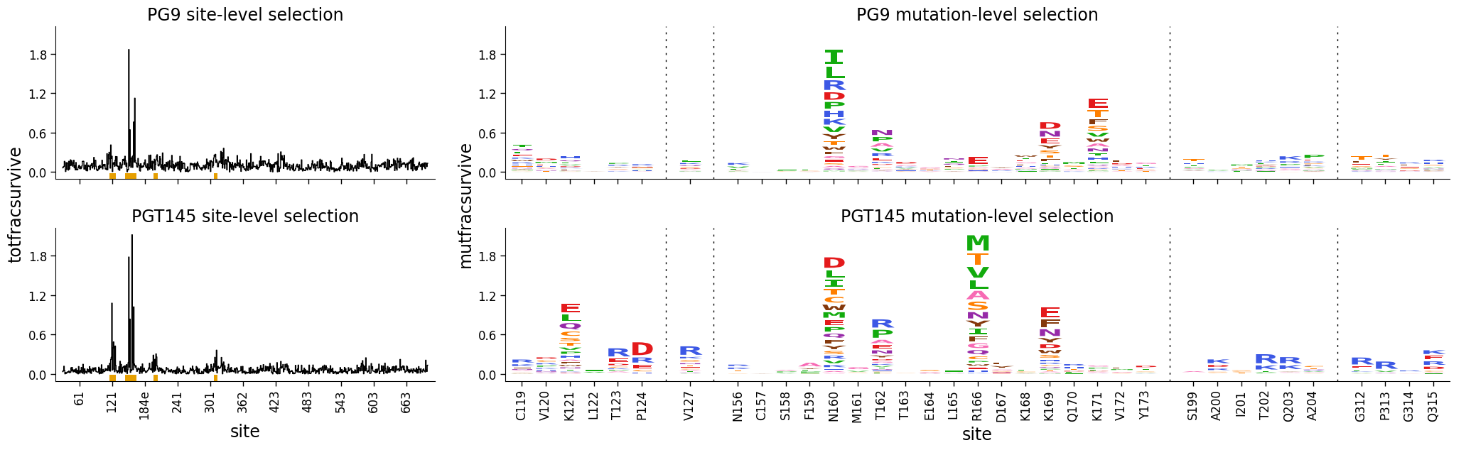
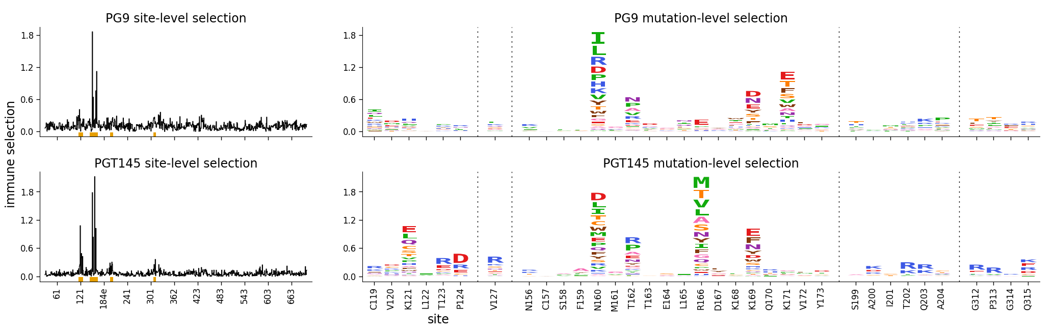
There are various options to tweak the formatting of the faceted plot. Here we demonstrate a few of them:
We assign a more generic ylabel (“immune selection”) to each plot via the appropriate
*_kwargsoption.We use the
share_ylim_across_rows=Falseoption to allow each row to have its own y-axis limits.We use the
share_xlabelandshare_ylabeloptions to share the x- and y-labels across the line and logo plots.
[29]:
# NBVAL_IGNORE_OUTPUT

fig, axes = dmslogo.facet_plot(
    data_hiv,
    gridrow_col="antibody",
    x_col="isite",
    show_col="show_site",
    draw_line_kwargs=dict(
        height_col="totfracsurvive", xtick_col="site", ylabel="immune selection"
    ),
    draw_logo_kwargs=dict(
        letter_col="mutation",
        letter_height_col="mutfracsurvive",
        xtick_col="site_label",
        xlabel="site",
        ylabel="immune selection",
    ),
    line_titlesuffix="site-level selection",
    logo_titlesuffix="mutation-level selection",
    share_ylim_across_rows=False,
    share_xlabel=True,
    share_ylabel=True,
)
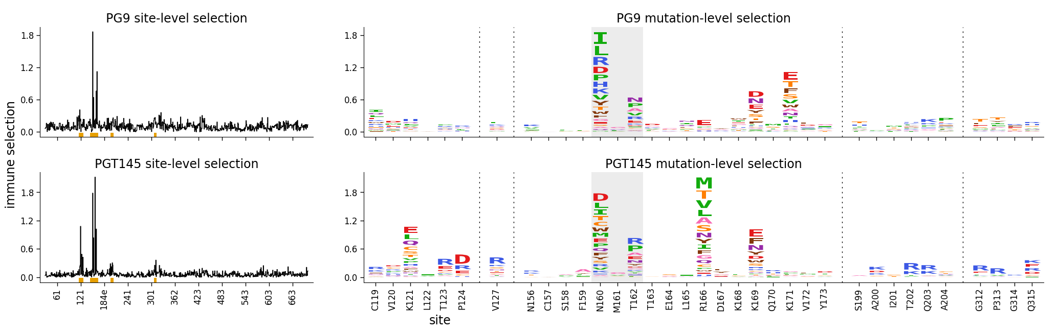
Finally, here is the same plot where we have shaded the N-linked glycan at 160:
[30]:
# NBVAL_IGNORE_OUTPUT

data_hiv["shade_color"] = numpy.where(
    data_hiv["site"].isin(["160", "161", "162"]), "gray", None
)
data_hiv["shade_alpha"] = numpy.where(
    data_hiv["site"].isin(["160", "161", "162"]), 0.15, None
)

fig, axes = dmslogo.facet_plot(
    data_hiv,
    gridrow_col="antibody",
    x_col="isite",
    show_col="show_site",
    draw_line_kwargs=dict(
        height_col="totfracsurvive", xtick_col="site", ylabel="immune selection"
    ),
    draw_logo_kwargs=dict(
        letter_col="mutation",
        letter_height_col="mutfracsurvive",
        xtick_col="site_label",
        xlabel="site",
        ylabel="immune selection",
        shade_color_col="shade_color",
        shade_alpha_col="shade_alpha",
    ),
    line_titlesuffix="site-level selection",
    logo_titlesuffix="mutation-level selection",
    share_ylim_across_rows=False,
    share_xlabel=True,
    share_ylabel=True,
)
Some details about fonts
Write DMSLOGO in Comic Sans font
Generate data to plot by creating the pandas DataFrame word_data. In this data frame, we choose large heights and bright colors for the letters in our word (DMSLOGO), and smaller letters and gray for other letters.
[31]:
word = "DMSLOGO"
lettercolors = [CBPALETTE[1]] * len("dms") + [CBPALETTE[2]] * len("logo")

# make data frame with data to plot
random.seed(0)
word_data = {"x": [], "letter": [], "height": [], "color": []}
for x, (letter, color) in enumerate(zip(word, lettercolors)):
    word_data["x"].append(x)
    word_data["letter"].append(letter)
    word_data["color"].append(color)
    word_data["height"].append(random.uniform(1, 1.5))
    for otherletter in random.sample(sorted(set("ACTG") - {letter}), 3):
        word_data["x"].append(x)
        word_data["letter"].append(otherletter)
        word_data["color"].append(CBPALETTE[0])
        word_data["height"].append(random.uniform(0.1, 0.5))
word_data = pd.DataFrame(word_data)
word_data.head(n=6)
[31]:
| x | letter | height | color | |
|---|---|---|---|---|
| 0 | 0 | D | 1.422211 | #E69F00 |
| 1 | 0 | T | 0.486186 | #999999 |
| 2 | 0 | A | 0.294371 | #999999 |
| 3 | 0 | C | 0.467294 | #999999 |
| 4 | 1 | M | 1.414926 | #E69F00 |
| 5 | 1 | T | 0.301875 | #999999 |
Now draw the logo. We use the fontfamily argument to set a Comic Sans font. This also requires us to increase fontaspect since this font is wider, and increase letterpad as the font height sometimes sticks out beyond its baseline:
[32]:
# NBVAL_IGNORE_OUTPUT

fig, ax = dmslogo.draw_logo(
    data=word_data,
    letter_height_col="height",
    x_col="x",
    letter_col="letter",
    color_col="color",
    fontfamily="Comic Sans MS",
    hide_axis=True,
    fontaspect=0.85,
    letterpad=0.05,
)

Subtleties of non-default fonts
Note however that you in general may have difficulty using most fonts (other than the dmslogo default) for good-looking logos. The reason is that for a clean and accurate letter-height logo plots, the font must:
be mono-spaced
not have descenders
have all letters go exactly from the baseline to the top
You can manually edit a font to do this as has been done for the current dmslogo default font; to see more information on this look here for details.