Analyze simulated library of codon variants
This example does the following three major things:
Simulates a deep mutational scanning experiment on a “plausible” data set of barcoded codon variants.
Analyze the simulated experiment by examining the variant counts and functional scores.
Fits global epistasis models.
Setup for analysis
Import Python modules / packages:
[1]:
# NBVAL_IGNORE_OUTPUT

import collections
import itertools
import random
import tempfile
import time
import warnings

import numpy

import pandas as pd

from plotnine import *

import binarymap

import dmslogo  # used for preference logo plots

import dms_variants.codonvarianttable
import dms_variants.globalepistasis
import dms_variants.plotnine_themes
import dms_variants.simulate
from dms_variants.constants import CBPALETTE, CODONS_NOSTOP
Set parameters that define the simulated data. Except for that fact that we use a short gene to reduce the computational run-time of this notebook, these simulation parameters are designed to reflect what we might observe in a real Bloom lab deep mutational scanning experiment:
[2]:
seed = 1  # random number seed
genelength = 30  # gene length in codons
libs = ["lib_1", "lib_2"]  # distinct libraries of gene
variants_per_lib = 500 * genelength  # variants per library
avgmuts = 2.0  # average codon mutations per variant
bclen = 16  # length of nucleotide barcode for each variant
variant_error_rate = 0.005  # rate at which variant sequence mis-called
avgdepth_per_variant = 200  # average per-variant sequencing depth
lib_uniformity = 5  # uniformity of library pre-selection
noise = 0.02  # random noise in selections
bottlenecks = {  # bottlenecks from pre- to post-selection
    "tight_bottle": variants_per_lib * 5,
    "loose_bottle": variants_per_lib * 100,
}
Seed random number generator for reproducible output:
[3]:
random.seed(seed)
numpy.random.seed(seed)
Set pandas display options to show large chunks of Data Frames in this example:
[4]:
pd.set_option("display.max_columns", 20)
pd.set_option("display.width", 500)
Hide warnings that clutter output:
[5]:
warnings.simplefilter("ignore")
Set the gray grid plotnine theme defined in dms_variants.plotnine_themes as this gives a nice appearance for the plots:
[6]:
theme_set(dms_variants.plotnine_themes.theme_graygrid())
Simulate library of variants
Simulate wildtype gene sequence:
[7]:
geneseq = "".join(random.choices(CODONS_NOSTOP, k=genelength))
print(f"Wildtype gene of {genelength} codons:\n{geneseq}")
Wildtype gene of 30 codons:
AGATCCGTGATTCTGCGTGCTTACACCAACTCACGGGTGAAACGTGTAATCTTATGCAACAACGACTTACCTATCCGCAACATCCGGCTG
Generate a CodonVariantTable using simulate_CodonVariantTable function:
[8]:
variants = dms_variants.simulate.simulate_CodonVariantTable(
    geneseq=geneseq,
    bclen=bclen,
    library_specs={
        lib: {"avgmuts": avgmuts, "nvariants": variants_per_lib} for lib in libs
    },
    seed=seed,
)
We can get basic information about the CodonVariantTable, such as the sites, wildtype codons, and wildtype amino acids. Below we do this for the first few sites:
[9]:
variants.sites[:5]
[9]:
[1, 2, 3, 4, 5]
[10]:
list(variants.codons[r] for r in variants.sites[:5])
[10]:
['AGA', 'TCC', 'GTG', 'ATT', 'CTG']
[11]:
list(variants.aas[r] for r in variants.sites[:5])
[11]:
['R', 'S', 'V', 'I', 'L']
The different libraries in the table:
[12]:
variants.libraries
[12]:
['lib_1', 'lib_2']
Here is the data frame that contains all of the information on the barcoded variants (just looking at the first few lines)
[13]:
variants.barcode_variant_df.head(n=6)
[13]:
| library | barcode | variant_call_support | codon_substitutions | aa_substitutions | n_codon_substitutions | n_aa_substitutions | |
|---|---|---|---|---|---|---|---|
| 0 | lib_1 | AAAAAAAACGTTTTGT | 1 | CTG5TGG TCA11TCT | L5W | 2 | 1 |
| 1 | lib_1 | AAAAAAAGGCTTATAC | 5 | TCA11TGC | S11C | 1 | 1 |
| 2 | lib_1 | AAAAAAATCGTCCGTG | 2 | 0 | 0 | ||
| 3 | lib_1 | AAAAAAGACAACACCG | 5 | ATC25TTC | I25F | 1 | 1 |
| 4 | lib_1 | AAAAAAGATGTGGTGG | 3 | TCA11TTA CGG12GGT CGT15TGA ATC25GGA ATC28CGC | S11L R12G R15* I25G I28R | 5 | 5 |
| 5 | lib_1 | AAAAAAGTCATACTCG | 1 | CGG12TCA TGC19ACC AAC27CGC | R12S C19T N27R | 3 | 3 |
Analyze library composition
A CodonVariantTable has methods for summarizing and plotting properties of the barcoded variants. These methods can be used to analyze the barcoded variants themselves, or to analyze the frequency (or counts) of variants in the library in samples that have undergone some type of selection.
We have not yet added counts of the variants in any specific samples, so we just analyze the composition of the variant library itself. This is done by setting samples=None in the method calls below.
Number of variants in each library:
[14]:
variants.n_variants_df(samples=None)
[14]:
| library | sample | count | |
|---|---|---|---|
| 0 | lib_1 | barcoded variants | 15000 |
| 1 | lib_2 | barcoded variants | 15000 |
| 2 | all libraries | barcoded variants | 30000 |
Plot distribution of variant call supports, grouping together all variants with support \(\ge 8\):
[15]:
# NBVAL_IGNORE_OUTPUT

p = variants.plotVariantSupportHistogram(max_support=10)
p = p + theme(panel_grid_major_x=element_blank())  # no vertical grid lines
_ = p.draw(show=True)
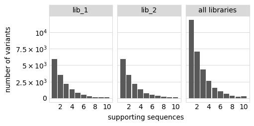
The set of valid barcodes for each library:
[16]:
for lib in libs:
    print(f"First few barcodes for library {lib}:")
    print(sorted(variants.valid_barcodes(lib))[:3])
First few barcodes for library lib_1:
['AAAAAAAACGTTTTGT', 'AAAAAAAGGCTTATAC', 'AAAAAAATCGTCCGTG']
First few barcodes for library lib_2:
['AAAAAACCCAGACTTA', 'AAAAAACCGGCGGCAG', 'AAAAAATCTACTGCGT']
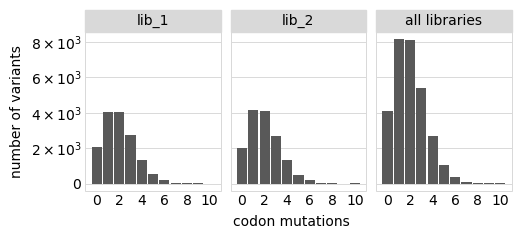
Plot the number of amino-acid mutations per variant:
[17]:
# NBVAL_IGNORE_OUTPUT

p = variants.plotNumMutsHistogram("aa", samples=None)
p = p + theme(panel_grid_major_x=element_blank())  # no vertical grid lines
_ = p.draw(show=True)

Number of codon mutations per variant:
[18]:
# NBVAL_IGNORE_OUTPUT

p = variants.plotNumMutsHistogram("codon", samples=None)
p = p + theme(panel_grid_major_x=element_blank())  # no vertical grid lines
_ = p.draw(show=True)
Average number of codon mutations per variant of each type of mutation. We make these plots for: 1. Just single-mutant and wildtype variants 2. For all variants
[19]:
# NBVAL_IGNORE_OUTPUT

for mut_type in ["single", "all"]:
    p = variants.plotNumCodonMutsByType(mut_type, samples=None)
    p = p + theme(panel_grid_major_x=element_blank())  # no vertical grid lines
    _ = p.draw(show=True)
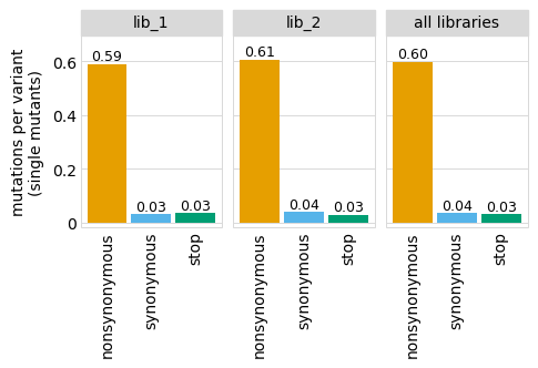
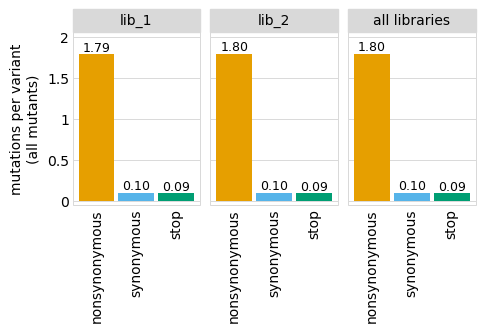
Here are the numerical data in the plots above:
[20]:
variants.numCodonMutsByType("single", samples=None).round(3)
[20]:
| library | sample | mutation_type | num_muts_count | count | number | |
|---|---|---|---|---|---|---|
| 0 | lib_1 | barcoded variants | nonsynonymous | 3615 | 6112 | 0.591 |
| 1 | lib_1 | barcoded variants | synonymous | 194 | 6112 | 0.032 |
| 2 | lib_1 | barcoded variants | stop | 211 | 6112 | 0.035 |
| 3 | lib_2 | barcoded variants | nonsynonymous | 3716 | 6114 | 0.608 |
| 4 | lib_2 | barcoded variants | synonymous | 235 | 6114 | 0.038 |
| 5 | lib_2 | barcoded variants | stop | 179 | 6114 | 0.029 |
| 6 | all libraries | barcoded variants | nonsynonymous | 7331 | 12226 | 0.600 |
| 7 | all libraries | barcoded variants | synonymous | 429 | 12226 | 0.035 |
| 8 | all libraries | barcoded variants | stop | 390 | 12226 | 0.032 |
[21]:
variants.numCodonMutsByType("all", samples=None).round(3)
[21]:
| library | sample | mutation_type | num_muts_count | count | number | |
|---|---|---|---|---|---|---|
| 0 | lib_1 | barcoded variants | nonsynonymous | 26916 | 15000 | 1.794 |
| 1 | lib_1 | barcoded variants | synonymous | 1510 | 15000 | 0.101 |
| 2 | lib_1 | barcoded variants | stop | 1424 | 15000 | 0.095 |
| 3 | lib_2 | barcoded variants | nonsynonymous | 26960 | 15000 | 1.797 |
| 4 | lib_2 | barcoded variants | synonymous | 1498 | 15000 | 0.100 |
| 5 | lib_2 | barcoded variants | stop | 1371 | 15000 | 0.091 |
| 6 | all libraries | barcoded variants | nonsynonymous | 53876 | 30000 | 1.796 |
| 7 | all libraries | barcoded variants | synonymous | 3008 | 30000 | 0.100 |
| 8 | all libraries | barcoded variants | stop | 2795 | 30000 | 0.093 |
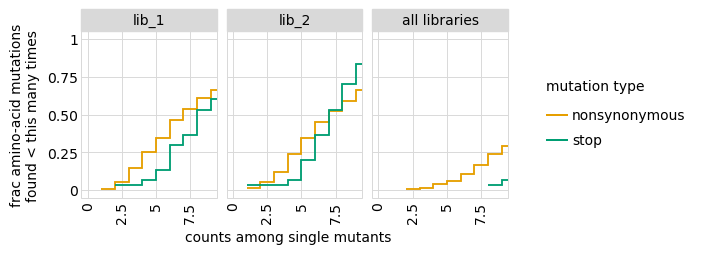
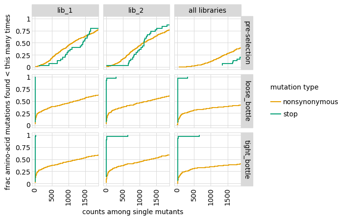
Examine how well amino-acid mutations are sampled in the library by looking at the fraction of mutations seen <= some number of times. Here we do that for amino- acid mutations, making separate plots for single mutants and all mutants:
[22]:
# NBVAL_IGNORE_OUTPUT

for variant_type in ["single", "all"]:
    p = variants.plotCumulMutCoverage(variant_type, mut_type="aa", samples=None)
    _ = p.draw(show=True)
We can also get the numerical information plotted above (here for single mutants only):
[23]:
variants.mutCounts("single", "aa", samples=None).head(n=5)
[23]:
| library | sample | mutation | count | mutation_type | site | |
|---|---|---|---|---|---|---|
| 0 | lib_1 | barcoded variants | V16L | 25 | nonsynonymous | 16 |
| 1 | lib_1 | barcoded variants | C19R | 21 | nonsynonymous | 19 |
| 2 | lib_1 | barcoded variants | R12S | 21 | nonsynonymous | 12 |
| 3 | lib_1 | barcoded variants | R26L | 21 | nonsynonymous | 26 |
| 4 | lib_1 | barcoded variants | S11R | 21 | nonsynonymous | 11 |
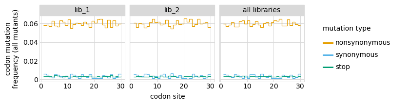
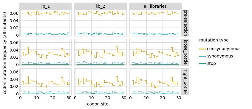
Here are the frequencies of mutations along the gene, looking both at single mutants and all mutants:
[24]:
# NBVAL_IGNORE_OUTPUT

for variant_type in ["single", "all"]:
    p = variants.plotMutFreqs(variant_type, "codon", samples=None)
    _ = p.draw(show=True)
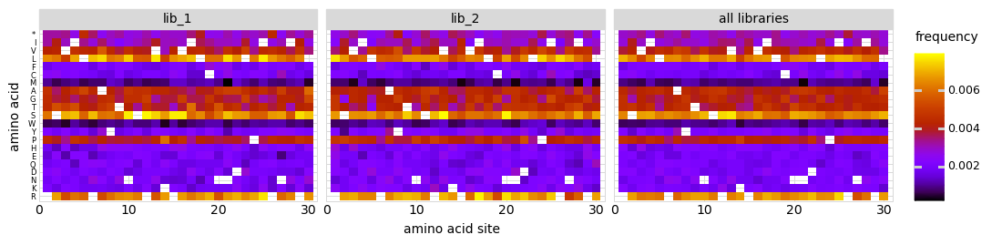
We can also look at mutation frequencies in a heat-map form:
[25]:
# NBVAL_IGNORE_OUTPUT

p = variants.plotMutHeatmap("all", "aa", samples=None)
_ = p.draw(show=True)
Simulate counts for samples
An experiment involves subjecting the library to different selections and looking at how the frequencies of the variants changes by using sequencing to count the barcodes in each condition.
Here, we simulate an experiment by simulating variant counts for samples that have undergone various selections.
For these simulations, we first need to define a “phenotype” for each variant. The phenotype represents how much the frequency of the variant is expected to increase or decrease after selection.
Define phenotype function
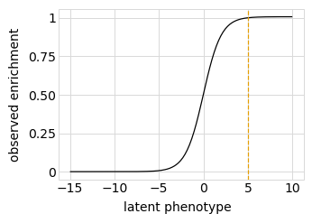
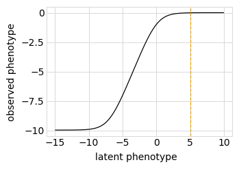
First, we define a “phenotype” function. We will do this using a SigmoidPhenotypeSimulator, which follow the “global epistasis” concepts of Otwinoski et al and Sailer and Harms to define the phenotype in two steps: an underlying latent phenotype that mutations affect additively, and then an observed phenotype that is a non-linear function of the latent phenotype. The variants are then simulated according to their observed enrichments, which are the exponentials of the observed phenotypes.
First, we initialize the simulator:
[26]:
phenosimulator = dms_variants.simulate.SigmoidPhenotypeSimulator(geneseq, seed=seed)
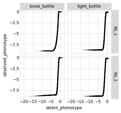
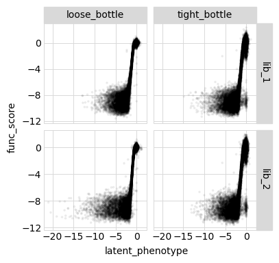
Plot the simulated relationship of the latent phenotype with the observed enrichment and phenotype, with a dashed vertical line indicating the wildtype latent phenotype:
[27]:
# NBVAL_IGNORE_OUTPUT

for value in ["enrichment", "phenotype"]:
    p = phenosimulator.plotLatentVsObserved(value)
    _ = p.draw(show=True)
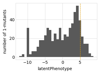
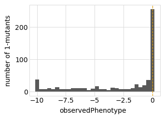
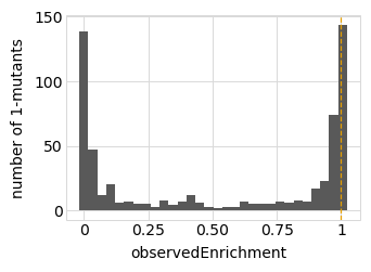
Plot the latent phenotype, observed phenotype, and observed enrichment of all single amino-acid mutants, with a dashed vertical line indicating the wildtype:
[28]:
# NBVAL_IGNORE_OUTPUT

for value in ["latentPhenotype", "observedPhenotype", "observedEnrichment"]:
    p = phenosimulator.plotMutsHistogram(value)
    _ = p.draw(show=True)
Simulate variant counts
Now we use simulateSampleCounts to simulate counts of variants when selection on each variant is proportional to its observed enrichment. In these simulations, we can fine-tune the simulations to reflect real experiments, such as by setting the error-rate in variant calling, bottlenecks when going from the pre- to post-selection samples, and non-uniformity in library composition.
Here we simulate using several bottlenecks in the library going from the pre- to post-selection samples, since in real experiments this seems to be the biggest source of noise / error:
[29]:
counts = dms_variants.simulate.simulateSampleCounts(
    variants=variants,
    phenotype_func=phenosimulator.observedEnrichment,
    variant_error_rate=variant_error_rate,
    pre_sample={
        "total_count": variants_per_lib * numpy.random.poisson(avgdepth_per_variant),
        "uniformity": lib_uniformity,
    },
    pre_sample_name="pre-selection",
    post_samples={
        name: {
            "noise": noise,
            "total_count": variants_per_lib
            * numpy.random.poisson(avgdepth_per_variant),
            "bottleneck": bottle,
        }
        for name, bottle in bottlenecks.items()
    },
    seed=seed,
)
First few lines of the data frame with the simulated counts:
[30]:
counts.head(n=5)
[30]:
| library | barcode | sample | count | |
|---|---|---|---|---|
| 0 | lib_1 | AAAAAAAACGTTTTGT | pre-selection | 344 |
| 1 | lib_1 | AAAAAAAGGCTTATAC | pre-selection | 120 |
| 2 | lib_1 | AAAAAAATCGTCCGTG | pre-selection | 138 |
| 3 | lib_1 | AAAAAAGACAACACCG | pre-selection | 108 |
| 4 | lib_1 | AAAAAAGATGTGGTGG | pre-selection | 352 |
Add counts to variant table
Now add the simulated counts for each library / sample to the CodonVariantTable:
[31]:
variants.add_sample_counts_df(counts)
Confirm that we have added the expected number of counts per library / sample:
[32]:
variants.n_variants_df()
[32]:
| library | sample | count | |
|---|---|---|---|
| 0 | lib_1 | pre-selection | 2760000 |
| 1 | lib_1 | loose_bottle | 2820000 |
| 2 | lib_1 | tight_bottle | 3105000 |
| 3 | lib_2 | pre-selection | 2760000 |
| 4 | lib_2 | loose_bottle | 2820000 |
| 5 | lib_2 | tight_bottle | 3105000 |
| 6 | all libraries | pre-selection | 5520000 |
| 7 | all libraries | loose_bottle | 5640000 |
| 8 | all libraries | tight_bottle | 6210000 |
Analyze sample variant counts
A CodonVariantTable has methods for summarizing and plotting the variant counts for different samples. These methods are mostly the same as we used above to analyze the variant composition of the libraries themselves, but now we set samples to the samples that we want to analyze (typically 'all'). Therefore, rather than each variant always counting once,
each variant is counted in each sample in proportion to how many counts it has.
In the rawest form, we can directly access a data frame giving the counts of each variant in each sample:
[33]:
variants.variant_count_df.head(n=5)
[33]:
| library | sample | barcode | count | variant_call_support | codon_substitutions | aa_substitutions | n_codon_substitutions | n_aa_substitutions | |
|---|---|---|---|---|---|---|---|---|---|
| 0 | lib_1 | pre-selection | AACCCGTTCACCACCA | 722 | 2 | ATC17CGA CGG29TGC | I17R R29C | 2 | 2 |
| 1 | lib_1 | pre-selection | CGCAAAAGTCTATTAC | 646 | 1 | TCA11GCG | S11A | 1 | 1 |
| 2 | lib_1 | pre-selection | TCCATTTGAATTGTTT | 640 | 1 | CGG12CCA CGT15CCG | R12P R15P | 2 | 2 |
| 3 | lib_1 | pre-selection | CCAGAAAACCCACCAA | 623 | 7 | TTA18CTC | 1 | 0 | |
| 4 | lib_1 | pre-selection | TTTGCGCGACTTTTAG | 610 | 1 | AAC21CAT ATC28TGG | N21H I28W | 2 | 2 |
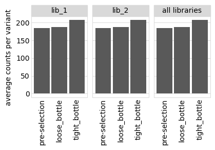
First, we get the average number of counts per variant:
[34]:
variants.avgCountsPerVariant().convert_dtypes()
[34]:
| library | sample | avg_counts_per_variant | |
|---|---|---|---|
| 0 | lib_1 | pre-selection | 184 |
| 1 | lib_1 | loose_bottle | 188 |
| 2 | lib_1 | tight_bottle | 207 |
| 3 | lib_2 | pre-selection | 184 |
| 4 | lib_2 | loose_bottle | 188 |
| 5 | lib_2 | tight_bottle | 207 |
| 6 | all libraries | pre-selection | 184 |
| 7 | all libraries | loose_bottle | 188 |
| 8 | all libraries | tight_bottle | 207 |
We also plot the average counts per variant:
[35]:
# NBVAL_IGNORE_OUTPUT

p = variants.plotAvgCountsPerVariant()
p = p + theme(panel_grid_major_x=element_blank())  # no vertical grid lines
_ = p.draw(show=True)
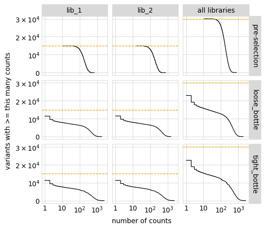
Plot the number of counts for each variant in each sample. The horizontal dashed line shows the total number of variants. The plot shows that all variants are well-sampled in the pre-selection libraries, but that post- selection some variants are sampled more or less. This is expected since selection will decrease and increase the frequency of variants:
[36]:
# NBVAL_IGNORE_OUTPUT

p = variants.plotCumulVariantCounts()
_ = p.draw(show=True)
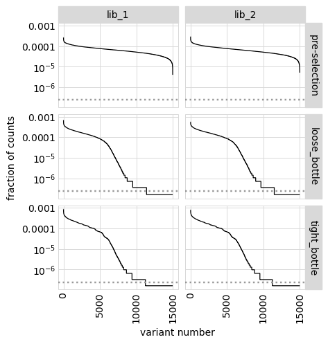
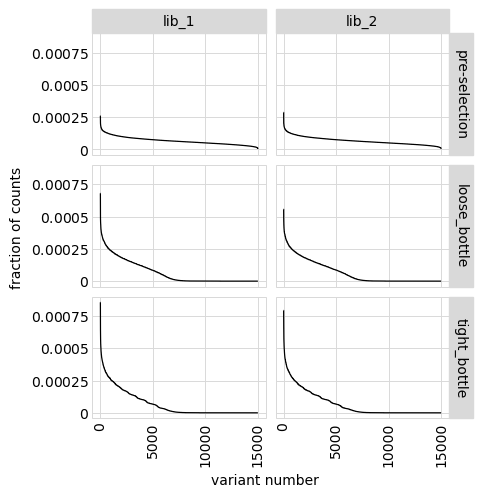
An alternative way to see how many any given variant dominates the library. One way to do that is to determine fraction of counts in each library from each variant and then plot how these fractions are distributed among variants.
In the plot below, variants with no counts are shown on the log y-scale below the dotted gray line:
[37]:
# NBVAL_IGNORE_OUTPUT

p = variants.plotCountsPerVariant(libraries=variants.libraries)
_ = p.draw(show=True)
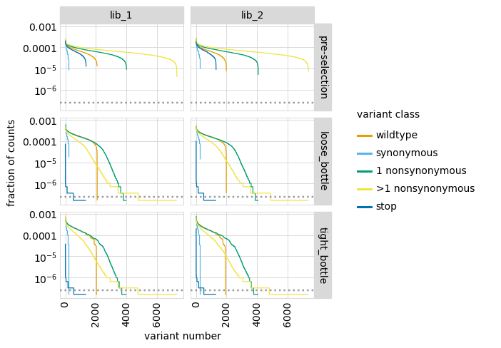
We can also make a similar plot showing the values for each class of variant separately, where we can see how post-selection some classes of variants drop in counts more than others:
[38]:
# NBVAL_IGNORE_OUTPUT

p = variants.plotCountsPerVariant(libraries=variants.libraries, by_variant_class=True)
_ = p.draw(show=True)
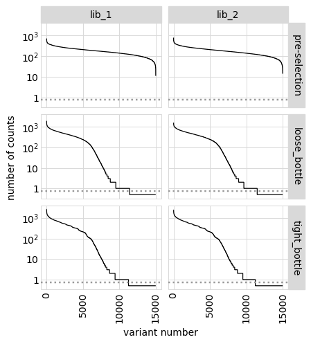
We can also show total counts rather than fraction of counts:
[39]:
# NBVAL_IGNORE_OUTPUT

p = variants.plotCountsPerVariant(libraries=variants.libraries, ystat="count")
_ = p.draw(show=True)
Or plot on a non-log y-scale (although this generally is less informative):
[40]:
# NBVAL_IGNORE_OUTPUT

p = variants.plotCountsPerVariant(libraries=variants.libraries, logy=False)
_ = p.draw(show=True)
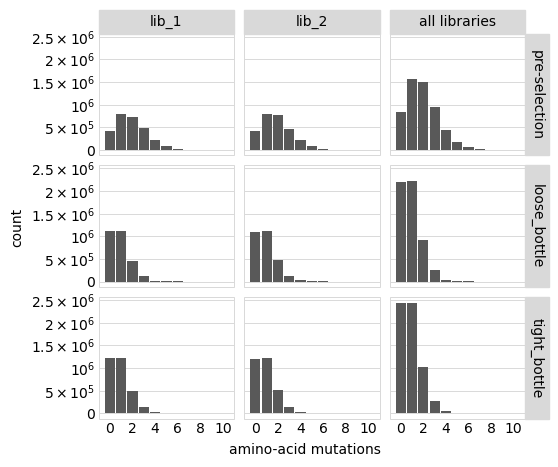
Distribution of the number of amino-acid mutations per variant in each sample. As expected, mutations go down after selection:
[41]:
# NBVAL_IGNORE_OUTPUT

p = variants.plotNumMutsHistogram(mut_type="aa")
p = p + theme(panel_grid_major_x=element_blank())  # no vertical grid lines
_ = p.draw(show=True)
Average number of mutations of each type per variant among just single mutants (and wildtype) and among all variants:
[42]:
# NBVAL_IGNORE_OUTPUT

for variant_type in ["single", "all"]:
    p = variants.plotNumCodonMutsByType(variant_type)
    p = p + theme(panel_grid_major_x=element_blank())  # no vertical grid lines
    _ = p.draw(show=True)
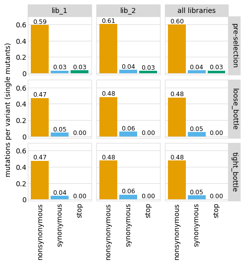
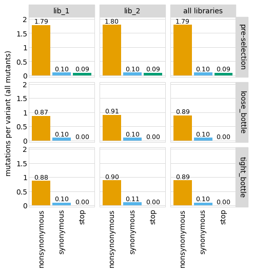
Here are the numerical data plotted above (just for the individual libraries and all mutations):
[43]:
# NBVAL_IGNORE_OUTPUT

variants.numCodonMutsByType(variant_type="all", libraries=libs).round(3)
[43]:
| library | sample | mutation_type | num_muts_count | count | number | |
|---|---|---|---|---|---|---|
| 0 | lib_1 | pre-selection | nonsynonymous | 4934898 | 2760000 | 1.788 |
| 1 | lib_1 | pre-selection | synonymous | 279387 | 2760000 | 0.101 |
| 2 | lib_1 | pre-selection | stop | 260846 | 2760000 | 0.095 |
| 3 | lib_1 | loose_bottle | nonsynonymous | 2463111 | 2820000 | 0.873 |
| 4 | lib_1 | loose_bottle | synonymous | 282348 | 2820000 | 0.100 |
| 5 | lib_1 | loose_bottle | stop | 900 | 2820000 | 0.000 |
| 6 | lib_1 | tight_bottle | nonsynonymous | 2727707 | 3105000 | 0.878 |
| 7 | lib_1 | tight_bottle | synonymous | 305938 | 3105000 | 0.099 |
| 8 | lib_1 | tight_bottle | stop | 933 | 3105000 | 0.000 |
| 9 | lib_2 | pre-selection | nonsynonymous | 4964286 | 2760000 | 1.799 |
| 10 | lib_2 | pre-selection | synonymous | 279432 | 2760000 | 0.101 |
| 11 | lib_2 | pre-selection | stop | 255340 | 2760000 | 0.093 |
| 12 | lib_2 | loose_bottle | nonsynonymous | 2553924 | 2820000 | 0.906 |
| 13 | lib_2 | loose_bottle | synonymous | 288997 | 2820000 | 0.102 |
| 14 | lib_2 | loose_bottle | stop | 998 | 2820000 | 0.000 |
| 15 | lib_2 | tight_bottle | nonsynonymous | 2782835 | 3105000 | 0.896 |
| 16 | lib_2 | tight_bottle | synonymous | 328619 | 3105000 | 0.106 |
| 17 | lib_2 | tight_bottle | stop | 1418 | 3105000 | 0.000 |
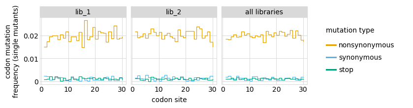
Here are mutation frequencies as a function of primary sequence among all variants:
[44]:
# NBVAL_IGNORE_OUTPUT

p = variants.plotMutFreqs(variant_type="all", mut_type="codon")
_ = p.draw(show=True)
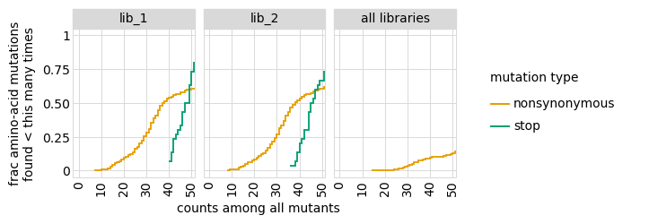
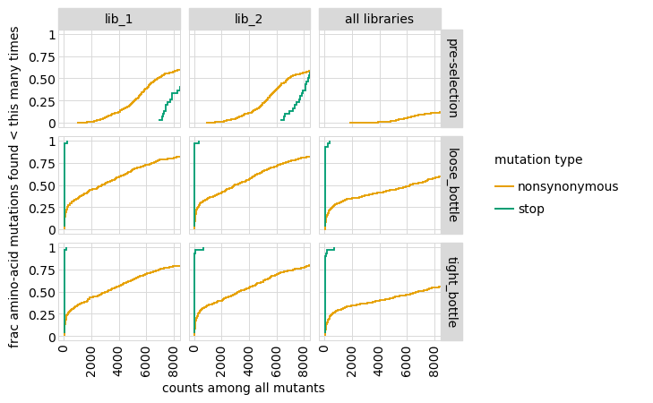
Plot how thoroughly amino-acid mutations are sampled, doing this separately among all variants and single-mutant variants. The plots below show that the stop mutations are sampled very poorly post-selection because they are eliminated during selection:
[45]:
# NBVAL_IGNORE_OUTPUT

for variant_type in ["single", "all"]:
    p = variants.plotCumulMutCoverage(variant_type=variant_type, mut_type="aa")
    _ = p.draw(show=True)
Functional scores for variants
The CodonVariantTable.func_scores method calculates a functional score for each variant based on its change in frequency from pre- to post-selection.
To calculate these scores, we need to pair each post-selection sample with a pre-selection one. In this case, the pre-selection sample is named ‘pre-selection’ for all post-selection samples:
[46]:
func_scores = variants.func_scores("pre-selection", libraries=libs)
The resulting data frame has a functional score (and its variance) for each barcoded variant:
[47]:
func_scores.head(n=5).round(3)
[47]:
| library | pre_sample | post_sample | barcode | func_score | func_score_var | pre_count | post_count | pre_count_wt | post_count_wt | pseudocount | codon_substitutions | n_codon_substitutions | aa_substitutions | n_aa_substitutions | |
|---|---|---|---|---|---|---|---|---|---|---|---|---|---|---|---|
| 0 | lib_1 | pre-selection | loose_bottle | AACCCGTTCACCACCA | -0.824 | 0.005 | 722 | 1077 | 388018 | 1024412 | 0.5 | ATC17CGA CGG29TGC | 2 | I17R R29C | 2 |
| 1 | lib_1 | pre-selection | loose_bottle | CGCAAAAGTCTATTAC | -0.120 | 0.005 | 646 | 1570 | 388018 | 1024412 | 0.5 | TCA11GCG | 1 | S11A | 1 |
| 2 | lib_1 | pre-selection | loose_bottle | TCCATTTGAATTGTTT | -2.141 | 0.009 | 640 | 383 | 388018 | 1024412 | 0.5 | CGG12CCA CGT15CCG | 2 | R12P R15P | 2 |
| 3 | lib_1 | pre-selection | loose_bottle | CCAGAAAACCCACCAA | 0.224 | 0.004 | 623 | 1922 | 388018 | 1024412 | 0.5 | TTA18CTC | 1 | 0 | |
| 4 | lib_1 | pre-selection | loose_bottle | TTTGCGCGACTTTTAG | -6.610 | 0.130 | 610 | 16 | 388018 | 1024412 | 0.5 | AAC21CAT ATC28TGG | 2 | N21H I28W | 2 |
We can also calculate functional scores at the level of amino-acid or codon substitutions rather than at the level of variants. This calculation groups all variants with the same substitutions before calculating the functional score. Here are scores grouping by amino-acid substitutions; we also set syn_as_wt=True to include variants with only synonymous mutations in the counts of wild type in this case:
[48]:
aa_func_scores = variants.func_scores(
    "pre-selection", by="aa_substitutions", syn_as_wt=True, libraries=libs
)
aa_func_scores.head(n=5).round(3)
[48]:
| library | pre_sample | post_sample | aa_substitutions | func_score | func_score_var | pre_count | post_count | pre_count_wt | post_count_wt | pseudocount | n_aa_substitutions | |
|---|---|---|---|---|---|---|---|---|---|---|---|---|
| 0 | lib_1 | pre-selection | loose_bottle | I17R R29C | -0.824 | 0.005 | 722 | 1077 | 425632 | 1123517 | 0.5 | 2 |
| 1 | lib_1 | pre-selection | loose_bottle | S11A | -0.032 | 0.002 | 1822 | 4704 | 425632 | 1123517 | 0.5 | 1 |
| 2 | lib_1 | pre-selection | loose_bottle | R12P R15P | -2.140 | 0.009 | 640 | 383 | 425632 | 1123517 | 0.5 | 2 |
| 3 | lib_1 | pre-selection | loose_bottle | 0.000 | 0.000 | 425632 | 1123517 | 425632 | 1123517 | 0.5 | 0 | |
| 4 | lib_1 | pre-selection | loose_bottle | N21H I28W | -6.610 | 0.130 | 610 | 16 | 425632 | 1123517 | 0.5 | 2 |
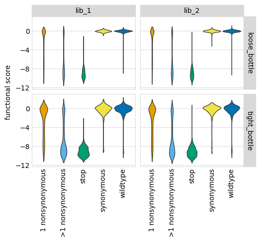
We can plot the distribution of the functional scores for variants. These plots are most informative if we classify variants by the “types” of mutations they have, which we do here using the CodonVariantTable.classifyVariants method, which adds a column called variant_class to the data frame:
[49]:
func_scores = dms_variants.codonvarianttable.CodonVariantTable.classifyVariants(
    func_scores
)

(func_scores.head(n=5)[["codon_substitutions", "aa_substitutions", "variant_class"]])
[49]:
| codon_substitutions | aa_substitutions | variant_class | |
|---|---|---|---|
| 0 | ATC17CGA CGG29TGC | I17R R29C | >1 nonsynonymous |
| 1 | TCA11GCG | S11A | 1 nonsynonymous |
| 2 | CGG12CCA CGT15CCG | R12P R15P | >1 nonsynonymous |
| 3 | TTA18CTC | synonymous | |
| 4 | AAC21CAT ATC28TGG | N21H I28W | >1 nonsynonymous |
Now we use plotnine to plot the distributions of scores in ggplot2-like syntax, coloring by the variant class. This plot shows the expected behavior for different variant classes; for instance, stop codon variants tend to have low scores and synonymous variants tend to have wildtype-like (near 0) scores. As expected, there is more noise with a tighter bottleneck:
[50]:
# NBVAL_IGNORE_OUTPUT

p = (
    ggplot(func_scores, aes("variant_class", "func_score"))
    + geom_violin(aes(fill="variant_class"))
    + ylab("functional score")
    + xlab("")
    + facet_grid("post_sample ~ library")
    + theme(
        figure_size=(2.75 * len(libs), 2 * len(bottlenecks)),
        axis_text_x=element_text(angle=90),
        panel_grid_major_x=element_blank(),  # no vertical grid lines
    )
    + scale_fill_manual(values=CBPALETTE[1:])
)
_ = p.draw(show=True)
Fit global epistasis models
We now fit global epistasis models to the functional scores from each simulated experiment. For background on these models, see Otwinoski et al (2018). The models we fits are implemented in dms_variants.globalepistasis, which has extensive documentation.
The primary model of interest is MonotonicSplineEpistasisGaussianLikelihood, which assumes that the observed phenotype is a monotonic non-linear function of an underlying additive latent phenotype. As a control, we also fit a NoEpistasisGaussianLikelihood model, which assumes that mutations simply contribute additively to the observed phenotype. Note that for both models we are using the Gaussian-likelihood calculation method to determine model fit (see dms_variants.globalepistasis for details)–as described in a later example, you might want to use a Bottleneck- or Cauchy-likelihood if there is a lot of experimental noise.
For the fitting, we first convert the set of functional scores into a binary representation using a BinaryMap. Then we create the model, fit it, and store it:
[51]:
# NBVAL_IGNORE_OUTPUT

models = {}  # store models, keyed by `(modeltype, sample, lib)`

for (sample, lib), scores in func_scores.groupby(["post_sample", "library"]):
    bmap = binarymap.BinaryMap(scores)

    for modeltype, EpistasisModel in [
        (
            "global epistasis",
            dms_variants.globalepistasis.MonotonicSplineEpistasisGaussianLikelihood,
        ),
        ("no epistasis", dms_variants.globalepistasis.NoEpistasisGaussianLikelihood),
    ]:
        print(f"Fitting {modeltype} model to {sample}, {lib}...", end=" ")

        start = time.time()
        model = EpistasisModel(bmap)
        model.fit()
        print(f"fitting took {time.time() - start:.1f} sec.")
        models[(modeltype, sample, lib)] = model
Fitting global epistasis model to loose_bottle, lib_1... fitting took 75.3 sec.
Fitting no epistasis model to loose_bottle, lib_1... fitting took 0.4 sec.
Fitting global epistasis model to loose_bottle, lib_2... fitting took 107.6 sec.
Fitting no epistasis model to loose_bottle, lib_2... fitting took 0.4 sec.
Fitting global epistasis model to tight_bottle, lib_1... fitting took 56.3 sec.
Fitting no epistasis model to tight_bottle, lib_1... fitting took 0.3 sec.
Fitting global epistasis model to tight_bottle, lib_2... fitting took 51.1 sec.
Fitting no epistasis model to tight_bottle, lib_2... fitting took 0.3 sec.
Now we want to see which model fits the data better. To do this, we get the log likelihood of each model along with the number of model parameters, as well as the AIC. Models with lower AIC are better, and below we see that the MonotonicSplineEpistasis global epistasis model always fits the data much better:
[52]:
# NBVAL_IGNORE_OUTPUT

logliks_df = pd.DataFrame.from_records(
    [
        (modeltype, sample, lib, model.nparams, model.loglik, model.aic)
        for (modeltype, sample, lib), model in models.items()
    ],
    columns=["model", "sample", "library", "n_parameters", "log_likelihood", "AIC"],
).set_index(["sample", "library"])

logliks_df.round(1)
[52]:
| model | n_parameters | log_likelihood | AIC | ||
|---|---|---|---|---|---|
| sample | library | ||||
| loose_bottle | lib_1 | global epistasis | 608 | -13303.9 | 27823.8 |
| lib_1 | no epistasis | 602 | -30387.9 | 61979.8 | |
| lib_2 | global epistasis | 608 | -12782.6 | 26781.2 | |
| lib_2 | no epistasis | 602 | -30255.3 | 61714.7 | |
| tight_bottle | lib_1 | global epistasis | 608 | -21868.5 | 44952.9 |
| lib_1 | no epistasis | 602 | -32341.2 | 65886.5 | |
| lib_2 | global epistasis | 608 | -22464.2 | 46144.4 | |
| lib_2 | no epistasis | 602 | -32360.1 | 65924.1 |
Because the MonotonicSplineEpistasis global epistasis model fits so much better than the additive NoEpistasis model, below we are just going to analyze the results from the global epistasis model.
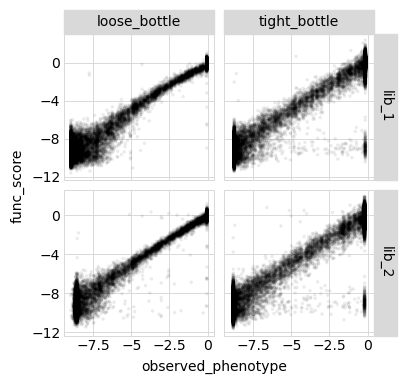
First, we will examine how the model looks on all the actual variants used to fit the model. We use AbstractEpistasis.phenotypes_df to get a data frame of all the variants used to fit each global epistasis model along with their functional scores and the latent and observed phenotypes predicted by each model. We also compute the measured and model-predicted enrichments for each variant (recall that the functional score / observed phenotype is the \(\log_2\) of the enrichment as described here):
[54]:
# NBVAL_IGNORE_OUTPUT

variants_df = pd.concat(
    [
        model.phenotypes_df.assign(
            sample=sample,
            library=lib,
            predicted_enrichment=lambda x: model.enrichments(x["observed_phenotype"]),
            measured_enrichment=lambda x: 2 ** x["func_score"],
        )
        for (modeltype, sample, lib), model in models.items()
        if modeltype == "global epistasis"
    ],
    ignore_index=True,
    sort=False,
)

variants_df.head().round(2)
[54]:
| aa_substitutions | func_score | func_score_var | latent_phenotype | observed_phenotype | sample | library | predicted_enrichment | measured_enrichment | |
|---|---|---|---|---|---|---|---|---|---|
| 0 | I17R R29C | -0.82 | 0.00 | -0.88 | -1.26 | loose_bottle | lib_1 | 0.43 | 0.56 |
| 1 | S11A | -0.12 | 0.00 | -0.15 | -0.05 | loose_bottle | lib_1 | 1.00 | 0.92 |
| 2 | R12P R15P | -2.14 | 0.01 | -1.06 | -2.61 | loose_bottle | lib_1 | 0.17 | 0.23 |
| 3 | 0.22 | 0.00 | 0.00 | -0.05 | loose_bottle | lib_1 | 1.00 | 1.17 | |
| 4 | N21H I28W | -6.61 | 0.13 | -1.77 | -6.33 | loose_bottle | lib_1 | 0.01 | 0.01 |
Below we plot the relationships among the latent phenotype from the model, the observed phenotype from the model, and the measured functional score for all variants used to fit the model:
[55]:
# NBVAL_IGNORE_OUTPUT

for x, y in itertools.combinations(
    ["latent_phenotype", "observed_phenotype", "func_score"], 2
):
    p = (
        ggplot(variants_df, aes(x, y))
        + geom_point(alpha=0.05, size=0.5)
        + facet_grid("library ~ sample", scales="free_y")
        + theme(
            figure_size=(
                2 * variants_df["sample"].nunique(),
                2 * variants_df["library"].nunique(),
            ),
        )
    )
    _ = p.draw(show=True)
Model vs measurements vs truth for all variants
Because we simulated the variants, we can also use the SigmoidPhenotypeSimulator used in these simulations to get the true phenotype of each variant. (Obviously in real non-simulated experiments the true phenotypes are unknown.) We get the true latent phenotype, the true observed phenotype (which corresponds to the functional score), and true enrichment:
[56]:
# NBVAL_IGNORE_OUTPUT

variants_df = variants_df.assign(
    true_latent_phenotype=lambda x: x["aa_substitutions"].map(
        phenosimulator.latentPhenotype
    ),
    true_enrichment=lambda x: x["aa_substitutions"].map(
        phenosimulator.observedEnrichment
    ),
    true_observed_phenotype=lambda x: x["aa_substitutions"].map(
        phenosimulator.observedPhenotype
    ),
)

variants_df.head().round(2)
[56]:
| aa_substitutions | func_score | func_score_var | latent_phenotype | observed_phenotype | sample | library | predicted_enrichment | measured_enrichment | true_latent_phenotype | true_enrichment | true_observed_phenotype | |
|---|---|---|---|---|---|---|---|---|---|---|---|---|
| 0 | I17R R29C | -0.82 | 0.00 | -0.88 | -1.26 | loose_bottle | lib_1 | 0.43 | 0.56 | -0.01 | 0.50 | -0.99 |
| 1 | S11A | -0.12 | 0.00 | -0.15 | -0.05 | loose_bottle | lib_1 | 1.00 | 0.92 | 4.14 | 0.99 | -0.01 |
| 2 | R12P R15P | -2.14 | 0.01 | -1.06 | -2.61 | loose_bottle | lib_1 | 0.17 | 0.23 | -1.28 | 0.22 | -2.18 |
| 3 | 0.22 | 0.00 | 0.00 | -0.05 | loose_bottle | lib_1 | 1.00 | 1.17 | 5.00 | 1.00 | 0.00 | |
| 4 | N21H I28W | -6.61 | 0.13 | -1.77 | -6.33 | loose_bottle | lib_1 | 0.01 | 0.01 | -5.00 | 0.01 | -7.02 |
Now we calculate the correlations between the true enrichment (from the simulation) and the measured enrichment or model-predicted enrichment, calculating the correlations across all variants. We do this using enrichment rather than observed phenotype as we expect the observed phenotypes to be very noisy at the “low end” (since experiments lose the sensitivity to distinguish among bad and really-bad variants):
[57]:
# NBVAL_IGNORE_OUTPUT

enrichments_corr = (
    variants_df.rename(
        columns={
            "predicted_enrichment": "model prediction",
            "measured_enrichment": "measurement",
        }
    )
    .melt(
        id_vars=["sample", "library", "true_enrichment"],
        value_vars=["model prediction", "measurement"],
        var_name="enrichment_type",
        value_name="enrichment",
    )
    .groupby(["sample", "library", "enrichment_type"])
    .apply(lambda x: x["enrichment"].corr(x["true_enrichment"]))
    .rename("correlation")
    .to_frame()
    .pivot_table(
        index=["sample", "library"], values="correlation", columns="enrichment_type"
    )
)

enrichments_corr.round(2)
[57]:
| enrichment_type | measurement | model prediction | |
|---|---|---|---|
| sample | library | ||
| loose_bottle | lib_1 | 0.98 | 1.0 |
| lib_2 | 0.98 | 1.0 | |
| tight_bottle | lib_1 | 0.83 | 1.0 |
| lib_2 | 0.82 | 1.0 |
And below are the correlation plots corresponding to the correlation coefficients tabulated above:
[59]:
# NBVAL_IGNORE_OUTPUT
p = (
ggplot(
variants_df.melt(
id_vars=["sample", "library", "true_enrichment"],
value_vars=["predicted_enrichment", "measured_enrichment"],
var_name="enrichment_type",
value_name="enrichment",
),
aes("true_enrichment", "enrichment"),
)
+ geom_point(alpha=0.05, size=0.5)
+ facet_grid("enrichment_type ~ sample + library", scales="free_y")
+ theme(
figure_size=(
2.5 * (variants_df["sample"].nunique() + variants_df["library"].nunique()),
5,
)
)
)
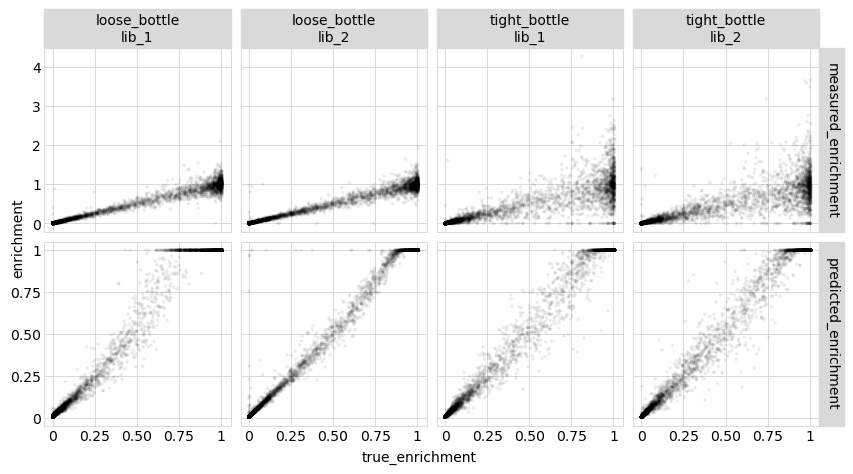
_ = p.draw(show=True)
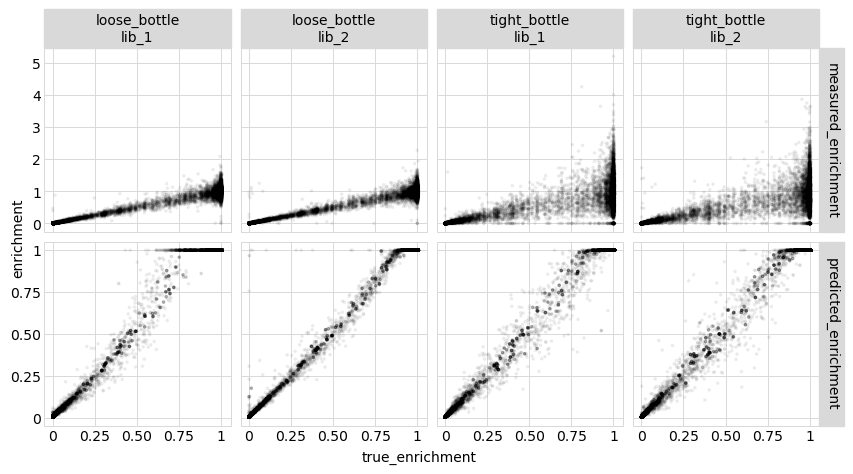
These results show that the model predictions are closer to the true values than the actual measurements, which is great! This could be because modeling the data helps extract more signal from multiple mutants–but it could also be for the trivial reason that the model effectively averages over multiple variants with the same mutations, which could be more accurate than the individual measurements. Therefore, in the next section we look at this issue…
Model vs measurements vs truth for amino-acid variants
We want to see if the model still outperforms the experiments if look at the level of amino-acid variants (meaning we pool the counts for all variants with the same amino-acid substitutions together before calculating the functional scores). Recall that above we already got such functional scores into the variable aa_func_scores:
First we get a data frame of simulated functional scores calculated at the level of amino-acid variants (pooling all barcoded variants with the same amino-acid mutations):
[60]:
aa_variants_df = aa_func_scores.rename(columns={"post_sample": "sample"})[
    ["sample", "library", "aa_substitutions", "n_aa_substitutions", "func_score"]
].assign(measured_enrichment=lambda x: 2 ** x["func_score"])

aa_variants_df.head().round(2)
[60]:
| sample | library | aa_substitutions | n_aa_substitutions | func_score | measured_enrichment | |
|---|---|---|---|---|---|---|
| 0 | loose_bottle | lib_1 | I17R R29C | 2 | -0.82 | 0.56 |
| 1 | loose_bottle | lib_1 | S11A | 1 | -0.03 | 0.98 |
| 2 | loose_bottle | lib_1 | R12P R15P | 2 | -2.14 | 0.23 |
| 3 | loose_bottle | lib_1 | 0 | 0.00 | 1.00 | |
| 4 | loose_bottle | lib_1 | N21H I28W | 2 | -6.61 | 0.01 |
Now we add the model-predicted latent phenotype, observed phenotype, and enrichment for each amino-acid variant using the AbstractEpistasis.add_phenotypes_to_df method:
[61]:
# NBVAL_IGNORE_OUTPUT

df_list = []
for (sample, lib), df in aa_variants_df.groupby(["sample", "library"]):
    model = models[("global epistasis", sample, lib)]
    df_list.append(
        model.add_phenotypes_to_df(df).assign(
            predicted_enrichment=lambda x: model.enrichments(x["observed_phenotype"])
        )
    )
aa_variants_df = pd.concat(df_list, ignore_index=True, sort=False)

aa_variants_df.head().round(2)
[61]:
| sample | library | aa_substitutions | n_aa_substitutions | func_score | measured_enrichment | latent_phenotype | observed_phenotype | predicted_enrichment | |
|---|---|---|---|---|---|---|---|---|---|
| 0 | loose_bottle | lib_1 | I17R R29C | 2 | -0.82 | 0.56 | -0.88 | -1.26 | 0.43 |
| 1 | loose_bottle | lib_1 | S11A | 1 | -0.03 | 0.98 | -0.15 | -0.05 | 1.00 |
| 2 | loose_bottle | lib_1 | R12P R15P | 2 | -2.14 | 0.23 | -1.06 | -2.61 | 0.17 |
| 3 | loose_bottle | lib_1 | 0 | 0.00 | 1.00 | 0.00 | -0.05 | 1.00 | |
| 4 | loose_bottle | lib_1 | N21H I28W | 2 | -6.61 | 0.01 | -1.77 | -6.33 | 0.01 |
Now we add the “true” values from the simulator:
[62]:
# NBVAL_IGNORE_OUTPUT

aa_variants_df = aa_variants_df.assign(
    true_latent_phenotype=lambda x: x["aa_substitutions"].map(
        phenosimulator.latentPhenotype
    ),
    true_enrichment=lambda x: x["aa_substitutions"].map(
        phenosimulator.observedEnrichment
    ),
    true_observed_phenotype=lambda x: x["aa_substitutions"].map(
        phenosimulator.observedPhenotype
    ),
)

aa_variants_df.head().round(2)
[62]:
| sample | library | aa_substitutions | n_aa_substitutions | func_score | measured_enrichment | latent_phenotype | observed_phenotype | predicted_enrichment | true_latent_phenotype | true_enrichment | true_observed_phenotype | |
|---|---|---|---|---|---|---|---|---|---|---|---|---|
| 0 | loose_bottle | lib_1 | I17R R29C | 2 | -0.82 | 0.56 | -0.88 | -1.26 | 0.43 | -0.01 | 0.50 | -0.99 |
| 1 | loose_bottle | lib_1 | S11A | 1 | -0.03 | 0.98 | -0.15 | -0.05 | 1.00 | 4.14 | 0.99 | -0.01 |
| 2 | loose_bottle | lib_1 | R12P R15P | 2 | -2.14 | 0.23 | -1.06 | -2.61 | 0.17 | -1.28 | 0.22 | -2.18 |
| 3 | loose_bottle | lib_1 | 0 | 0.00 | 1.00 | 0.00 | -0.05 | 1.00 | 5.00 | 1.00 | 0.00 | |
| 4 | loose_bottle | lib_1 | N21H I28W | 2 | -6.61 | 0.01 | -1.77 | -6.33 | 0.01 | -5.00 | 0.01 | -7.02 |
Now we calculate and plot the correlations between the true enrichments from the simulations and the measured values and the ones predicted by the model:
[63]:
# NBVAL_IGNORE_OUTPUT

enrichments_corr = (
    aa_variants_df.rename(
        columns={
            "predicted_enrichment": "model prediction",
            "measured_enrichment": "measurement",
        }
    )
    .melt(
        id_vars=["sample", "library", "true_enrichment"],
        value_vars=["model prediction", "measurement"],
        var_name="enrichment_type",
        value_name="enrichment",
    )
    .groupby(["sample", "library", "enrichment_type"])
    .apply(lambda x: x["enrichment"].corr(x["true_enrichment"]))
    .rename("correlation")
    .to_frame()
    .pivot_table(
        index=["sample", "library"], values="correlation", columns="enrichment_type"
    )
)

enrichments_corr.round(2)
[63]:
| enrichment_type | measurement | model prediction | |
|---|---|---|---|
| sample | library | ||
| loose_bottle | lib_1 | 0.99 | 0.99 |
| lib_2 | 0.99 | 0.99 | |
| tight_bottle | lib_1 | 0.88 | 1.00 |
| lib_2 | 0.87 | 0.99 |
[65]:
# NBVAL_IGNORE_OUTPUT
p = (
ggplot(
aa_variants_df.melt(
id_vars=["sample", "library", "true_enrichment"],
value_vars=["predicted_enrichment", "measured_enrichment"],
var_name="enrichment_type",
value_name="enrichment",
),
aes("true_enrichment", "enrichment"),
)
+ geom_point(alpha=0.05, size=0.5)
+ facet_grid("enrichment_type ~ sample + library", scales="free_y")
+ theme(
figure_size=(
2.5 * (variants_df["sample"].nunique() + variants_df["library"].nunique()),
5,
)
)
)
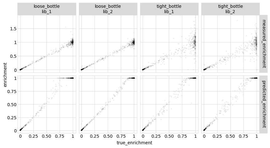
_ = p.draw(show=True)
The results above show that the model still outperforms the direct measurements even when the measurements are aggregated at the level of amino-acid variants.
Model vs measurements vs truth for single mutants
Now we repeat the above analysis for just single amino-acid mutants.
First, get the single amino-acid mutant variants:
[66]:
# NBVAL_IGNORE_OUTPUT

single_aa_variants_df = aa_variants_df.query("n_aa_substitutions == 1").reset_index(
    drop=True
)

single_aa_variants_df.head().round(2)
[66]:
| sample | library | aa_substitutions | n_aa_substitutions | func_score | measured_enrichment | latent_phenotype | observed_phenotype | predicted_enrichment | true_latent_phenotype | true_enrichment | true_observed_phenotype | |
|---|---|---|---|---|---|---|---|---|---|---|---|---|
| 0 | loose_bottle | lib_1 | S11A | 1 | -0.03 | 0.98 | -0.15 | -0.05 | 1.00 | 4.14 | 0.99 | -0.01 |
| 1 | loose_bottle | lib_1 | R1A | 1 | 0.06 | 1.04 | 0.13 | -0.05 | 1.00 | 5.76 | 1.00 | 0.01 |
| 2 | loose_bottle | lib_1 | I4P | 1 | -6.89 | 0.01 | -1.91 | -6.81 | 0.01 | -4.96 | 0.01 | -6.97 |
| 3 | loose_bottle | lib_1 | R26V | 1 | 0.00 | 1.00 | -0.36 | -0.05 | 1.00 | 3.15 | 0.97 | -0.05 |
| 4 | loose_bottle | lib_1 | R6* | 1 | -10.47 | 0.00 | -3.11 | -8.62 | 0.00 | -10.00 | 0.00 | -9.90 |
Now tabulate and plot how the model predictions and measurements compare to the true values:
[68]:
# NBVAL_IGNORE_OUTPUT

enrichments_corr = (
    single_aa_variants_df.rename(
        columns={
            "predicted_enrichment": "model prediction",
            "measured_enrichment": "measurement",
        }
    )
    .melt(
        id_vars=["sample", "library", "true_enrichment"],
        value_vars=["model prediction", "measurement"],
        var_name="enrichment_type",
        value_name="enrichment",
    )
    .groupby(["sample", "library", "enrichment_type"])
    .apply(lambda x: x["enrichment"].corr(x["true_enrichment"]))
    .rename("correlation")
    .to_frame()
    .pivot_table(
        index=["sample", "library"], values="correlation", columns="enrichment_type"
    )
)

enrichments_corr.round(2)
[68]:
| enrichment_type | measurement | model prediction | |
|---|---|---|---|
| sample | library | ||
| loose_bottle | lib_1 | 0.99 | 0.99 |
| lib_2 | 0.99 | 1.00 | |
| tight_bottle | lib_1 | 0.93 | 1.00 |
| lib_2 | 0.94 | 1.00 |
[70]:
# NBVAL_IGNORE_OUTPUT

p = (
    ggplot(
        single_aa_variants_df.melt(
            id_vars=["sample", "library", "true_enrichment"],
            value_vars=["predicted_enrichment", "measured_enrichment"],
            var_name="enrichment_type",
            value_name="enrichment",
        ),
        aes("true_enrichment", "enrichment"),
    )
    + geom_point(alpha=0.05, size=0.5)
    + facet_grid("enrichment_type ~ sample + library", scales="free_y")
    + theme(
        figure_size=(
            2.5 * (variants_df["sample"].nunique() + variants_df["library"].nunique()),
            5,
        )
    )
)

_ = p.draw(show=True)
We see that even for single mutants, fitting the global epistasis model leads to more accurate measurements of the effects of mutations. Presumably this is because these models are able to effectively extract information from the multiple mutants.
Effects of mutations
It’s often useful to try to summarize the effects of individual mutations with a single value. These values can then be nicely displayed in logo plots using programs like:
Here we will make some plots of mutational effects of various types using dmslogo. Do keep in mind, however, that the whole point of the epistasis models is that it isn’t possible to summarize everything about a mutation with a single value–so use such plots as they are very informative ways to look at the data, but also recognize they are summarizing the impacts of mutations down to one value.
Mutational effects on phenotype
One useful measure of the effects of mutations is simply how the single mutation changes the latent or observed phenotype (note that while the effect on the latent phenotype should be “universal”, that on the observed phenotype depends on the wildtype sequence).
The epistasis models have a single_mut_effects method to get these mutational effects. By default, this method scales the effects so that their mean absolute value is one.
Mutational effects on the latent phenotype:
[71]:
# NBVAL_IGNORE_OUTPUT

latenteffects_df = model.single_mut_effects("latent")

latenteffects_df.head().round(2)
[71]:
| mutation | wildtype | site | mutant | effect | |
|---|---|---|---|---|---|
| 0 | V13* | V | 13 | * | -4.95 |
| 1 | L23* | L | 23 | * | -4.93 |
| 2 | R6* | R | 6 | * | -4.83 |
| 3 | R26* | R | 26 | * | -4.79 |
| 4 | R15E | R | 15 | E | -4.77 |
Mutational effects on the observed phenotype:
[72]:
# NBVAL_IGNORE_OUTPUT

observedeffects_df = model.single_mut_effects("observed")

observedeffects_df.head().round(2)
[72]:
| mutation | wildtype | site | mutant | effect | |
|---|---|---|---|---|---|
| 0 | V13* | V | 13 | * | -3.41 |
| 1 | L23* | L | 23 | * | -3.41 |
| 2 | R6* | R | 6 | * | -3.41 |
| 3 | R26* | R | 26 | * | -3.41 |
| 4 | R15E | R | 15 | E | -3.41 |
Phenotypic mutational effects to “preferences”
It is sometimes useful to convert mutational effects to “preferences.” Essentially, the preferences are the exponential of the mutational effects re-scaled to sum to one at each site. In other words, the preference \(\pi_{r,a}\) of site \(r\) for character (e.g., amino acid) \(a\) is simply:
where \(p_{r,a}\) is the phenotype of the variant with the single mutation of site \(r\) to \(a\), and \(b\) is the logarithm base.
Amino-acid preferences are useful as they can be displayed in logo plots where the height of the letter is proportional to the preference for that amino acid, and can be used to fit experimentally informed phylogenetic substitution models using programs such as phydms to directly compare the deep mutational scanning experiments to natural evolution.
The epistasis models have a preferences method for getting the amino-acid preferences from the effects of single mutations on either the latent or observed phenotype (see also the scores_to_prefs function if you need to directly convert functional scores not within an epistasis model).
A very important point is that preferences are estimated for all characters (i.e., amino acids) at a site, even if there is not an effect estimated for that mutation! For missing scores, the preferences for missing characters are set to the average effects of all mutations (or optionally ammutations at that site); see docs for preferences for more details. This is necessary since the preferences are normalized per site. If you are missing just a few measurements this extrapolation of missing values may be fine, but it probably is not a good idea if you are missing lots of measurements.
For instance, the next cell converts the latent effects to a data frame of preferences using an exponent base of 10:
[73]:
# NBVAL_IGNORE_OUTPUT

prefs_base10 = model.preferences(phenotype="latent", base=10)

prefs_base10.head().round(3)
[73]:
| site | A | C | D | E | F | G | H | I | K | ... | M | N | P | Q | R | S | T | V | W | Y | |
|---|---|---|---|---|---|---|---|---|---|---|---|---|---|---|---|---|---|---|---|---|---|
| 0 | 1 | 0.094 | 0.027 | 0.001 | 0.010 | 0.201 | 0.008 | 0.024 | 0.006 | 0.177 | ... | 0.018 | 0.039 | 0.071 | 0.071 | 0.076 | 0.002 | 0.059 | 0.034 | 0.042 | 0.001 |
| 1 | 2 | 0.096 | 0.018 | 0.096 | 0.005 | 0.000 | 0.007 | 0.003 | 0.026 | 0.003 | ... | 0.095 | 0.049 | 0.006 | 0.065 | 0.019 | 0.158 | 0.003 | 0.155 | 0.065 | 0.000 |
| 2 | 3 | 0.126 | 0.032 | 0.000 | 0.149 | 0.044 | 0.005 | 0.024 | 0.068 | 0.028 | ... | 0.001 | 0.006 | 0.148 | 0.052 | 0.002 | 0.100 | 0.002 | 0.120 | 0.002 | 0.090 |
| 3 | 4 | 0.012 | 0.012 | 0.001 | 0.063 | 0.028 | 0.164 | 0.067 | 0.085 | 0.053 | ... | 0.043 | 0.062 | 0.002 | 0.008 | 0.043 | 0.090 | 0.113 | 0.045 | 0.006 | 0.055 |
| 4 | 5 | 0.071 | 0.004 | 0.003 | 0.006 | 0.003 | 0.007 | 0.061 | 0.004 | 0.058 | ... | 0.230 | 0.114 | 0.003 | 0.003 | 0.114 | 0.084 | 0.015 | 0.026 | 0.077 | 0.002 |
5 rows × 21 columns
We can also get the preferences in tidy format:
[74]:
# NBVAL_IGNORE_OUTPUT

prefs_base10_tidy = model.preferences(phenotype="latent", base=10, returnformat="tidy")

prefs_base10_tidy.tail().round(3)
[74]:
| wildtype | site | mutant | preference | |
|---|---|---|---|---|
| 595 | P | 24 | Y | 0.237 |
| 596 | S | 11 | C | 0.238 |
| 597 | I | 25 | Y | 0.240 |
| 598 | N | 10 | D | 0.243 |
| 599 | R | 29 | I | 0.257 |
Here we will plot these preferences using dmslogo:
[75]:
# NBVAL_IGNORE_OUTPUT

_ = dmslogo.draw_logo(
    data=prefs_base10_tidy,
    x_col="site",
    letter_col="mutant",
    letter_height_col="preference",
    title="exponent base 10",
)
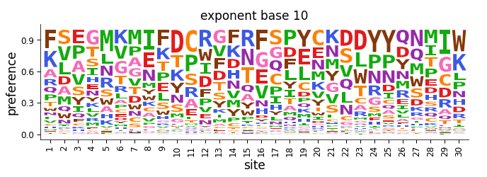
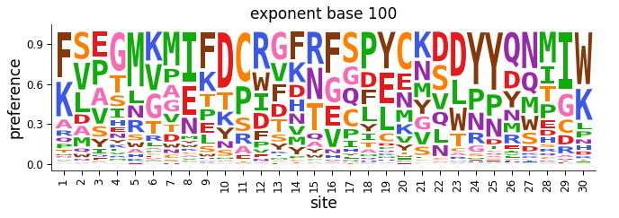
Note how the preferences plotted above look rather “flat”, with no amino acid appearing to be vastly more preferred than another. If we re-plot the data using a larger exponent base, the preferences are now less flat and more peaked:
[76]:
# NBVAL_IGNORE_OUTPUT

prefs_base100_tidy = model.preferences(
    phenotype="latent", base=100, returnformat="tidy"
)

_ = dmslogo.draw_logo(
    data=prefs_base100_tidy,
    x_col="site",
    letter_col="mutant",
    letter_height_col="preference",
    title="exponent base 100",
)
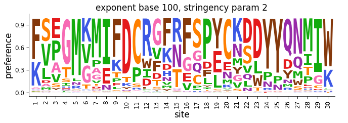
So what is the “best” exponent base to use? It turns out that different exponent bases simply correspond to different linear scalings of the phenotypic effects of mutations (you can see this by working through the math in the equation above to convert the phenotypes to preferences). So it’s not obvious what is the “best” exponent base when converting phenotypic effects to preferences, particularly for the latent effects of mutations which are themselves arbitrarily scaled.
We therefore recommend just choosing a base and then using phydms to fit a stringency parameter to scale the preferences so that they best match the strength of selection observed in natural evolution (see here). It turns out that scaling by a stringency parameter in this way is equivalent to choosing a different exponent base.
An important caveat in doing this is that for numerical reasons, phydms can only fit stringency parameters up to a maximum bound (currently 10). So if you are gettting that upper bound stringency parameter, you should use a larger exponent base when initially converting the phenotypic effects into preferences.
After you’ve gotten a stringency parameter, you can use it to re-scale the preferences you obtain from an epistasis model. For instance:
[77]:
# NBVAL_IGNORE_OUTPUT

stringency_param = 2

prefs_base100_tidy_stringency = model.preferences(
    phenotype="latent", base=100, returnformat="tidy", stringency_param=stringency_param
)

_ = dmslogo.draw_logo(
    data=prefs_base100_tidy_stringency,
    x_col="site",
    letter_col="mutant",
    letter_height_col="preference",
    title=f"exponent base 100, stringency param {stringency_param}",
)